How to Create an Infographic in PowerPoint and Save Time

Sometimes you need to break down complex information, present data clearly, or simply make your message easier to digest. In many cases, plain text or PowerPoint slides filled with bullet points just don’t do the job. That’s where infographics come in. They turn data into a visual story that’s quicker to process and much more memorable.
Our brains handle visuals up to 40 times faster than audio input or text. Images activate the primal parts of the brain responsible for quick decision-making, whereas text is processed more slowly by the rational-thinking neocortex. Infographic templates help bridge that gap between clarity and engagement. In a study of 400 students, 74% reported that they learned more effectively when information was presented visually as opposed to text.
In this guide, I’ll walk you through simple, time-saving tips for creating infographics directly in PowerPoint — no design skills needed. Whether you’re building a presentation, report, or social media post, you’ll learn how to turn complex information into visuals that are clear, engaging, and professional. And I’ll also share a tool I rely on to make it all even easier.
TL;DR
The article explains how to create effective infographics in PowerPoint to present complex information visually and clearly, highlighting that visuals are processed more faster than text. It outlines common infographic types and their uses, offers guidance on selecting templates and visual assets, and walks through the step-by-step creation process—from slide setup to adding data and styling. It also provides tips on exporting and adapting infographics for different formats and shares best practices and common pitfalls to avoid. Using tools like iSpring Suite can save time and enhance the design.
Types of Infographics and When to Use Them
Not every idea should be visualized the same way. Choosing the right type of infographic can help you deliver your message more clearly and save time during the creation process. Below are the most common types and how to use them effectively.
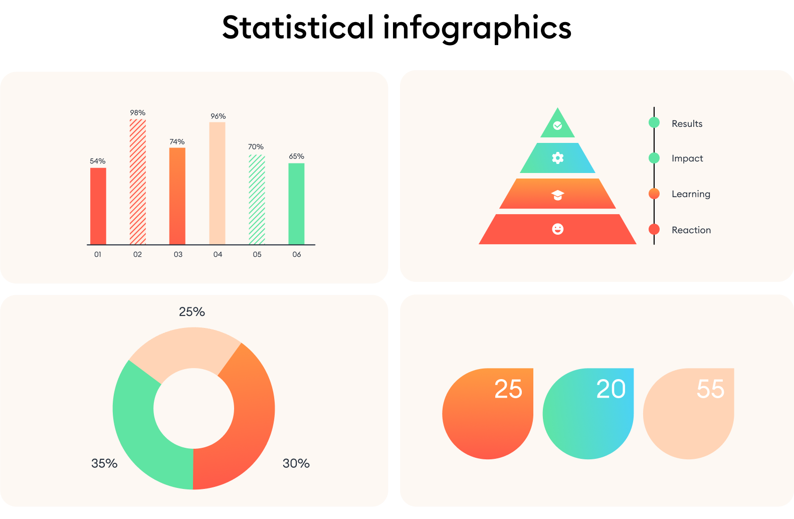
Statistical infographics
This type of infographic is best for presenting numbers, survey results, performance metrics, or research results. You can use it to highlight patterns, emphasize trends, or make raw data more accessible and engaging.
Example: A marketing team might use a statistical infographic to show how customer engagement has increased over several quarters, using pie charts, percentages, and simple visuals instead of spreadsheets or long explanations.
Process infographics
A process infographic works well when you need to explain how something works, step by step. It’s best for showing workflows, procedures, or any sequential information. You can use it to break down a task or guide into manageable stages that are easy to follow.
Example: An HR department could create a process infographic to outline the employee onboarding steps from initial paperwork to first-week training.

Timeline infographics
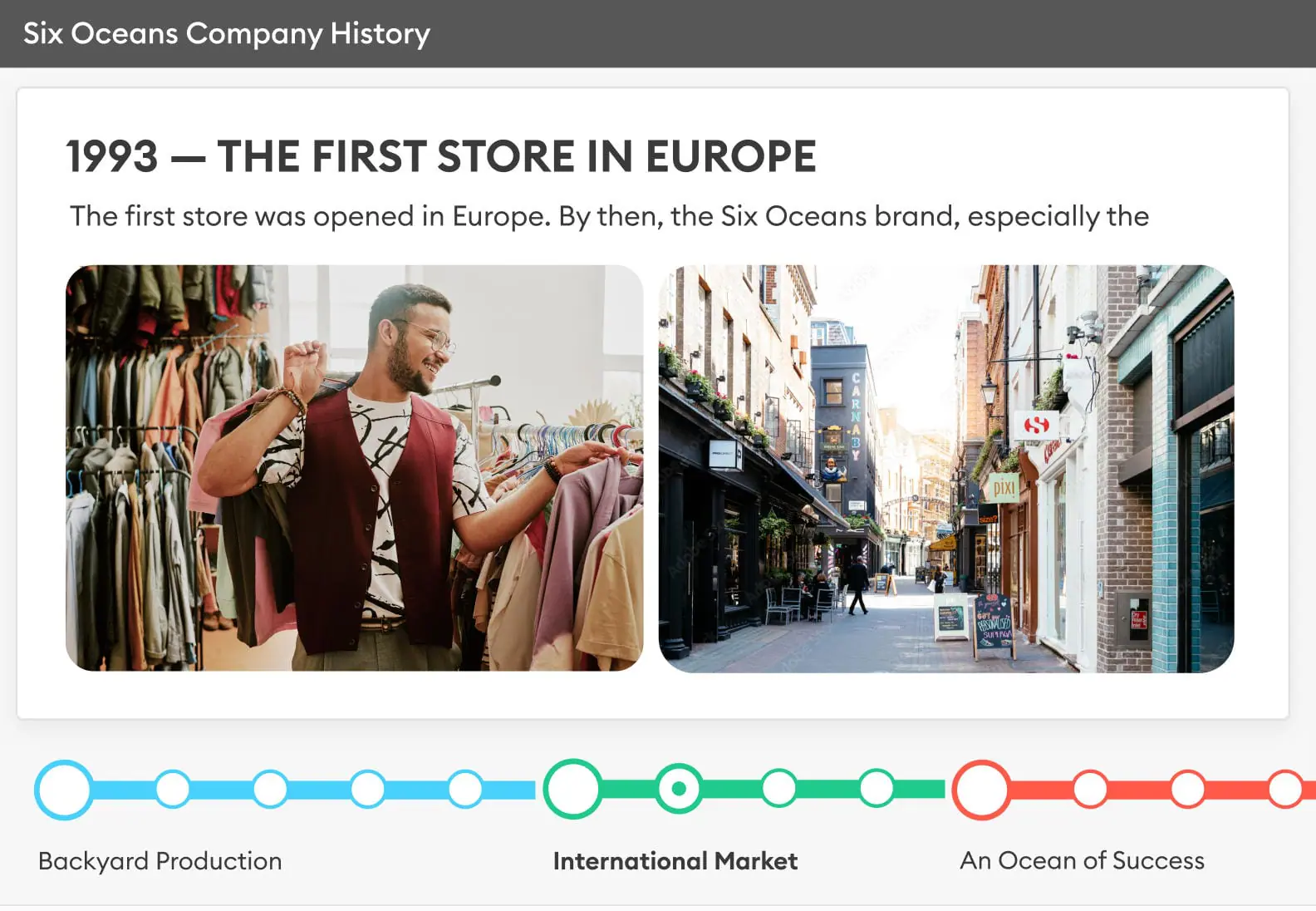
Timeline infographics are ideal for showing events or milestones in chronological order. You can use them for data visualization, such as history, development stages, or future planning. They help to quickly understand the sequence and timing of events.
Example: A product manager might use a timeline infographic to communicate a release roadmap to stakeholders, mapping out key launch dates and phases.

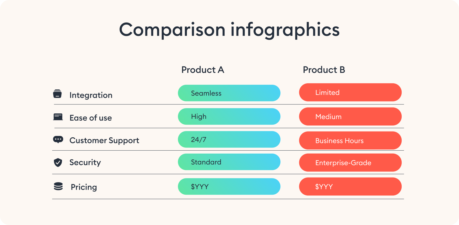
Comparison infographics
If you need to contrast two or more options side by side, a comparison infographic is a smart choice. It’s best for highlighting pros and cons, showing differences, or helping your audience make decisions. You can use it to evaluate features, pricing, performance, or any set of criteria.
Example: A sales team might use this format to show how their product compares to competitors in terms of value and functionality.
Geographic infographics
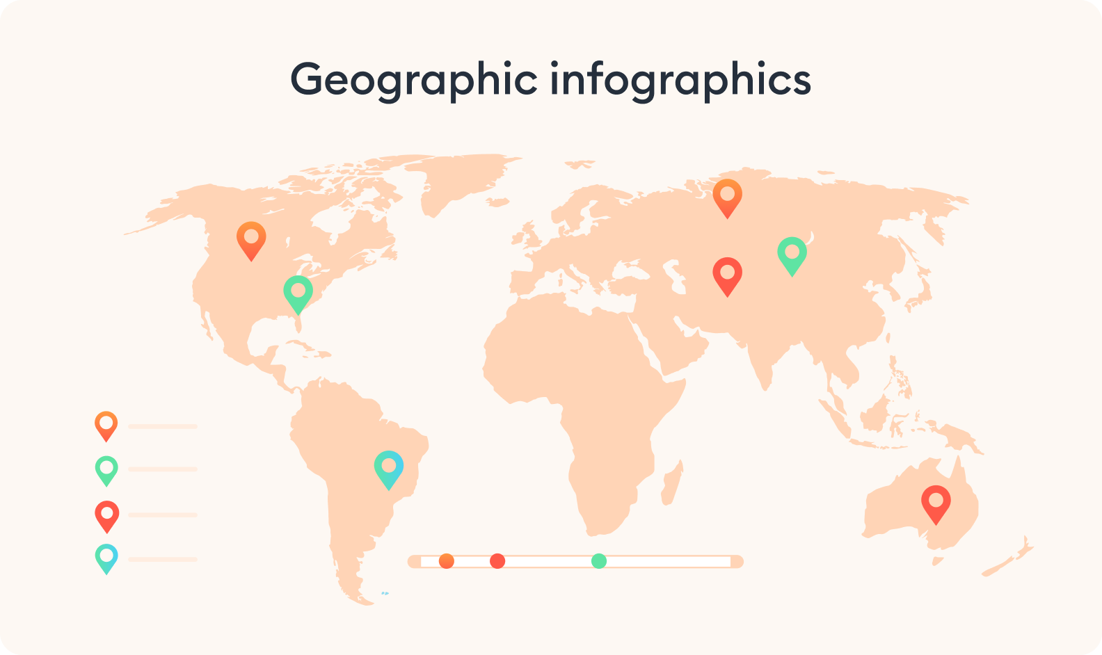
This format is used when location or geography plays a role in your data. It’s best for presenting region-based statistics, market coverage, or demographic distribution. You can use map infographics to add spatial context to your information.
Example: A nonprofit organization might use one to show the impact of its programs across different regions or countries.
Hierarchical infographics
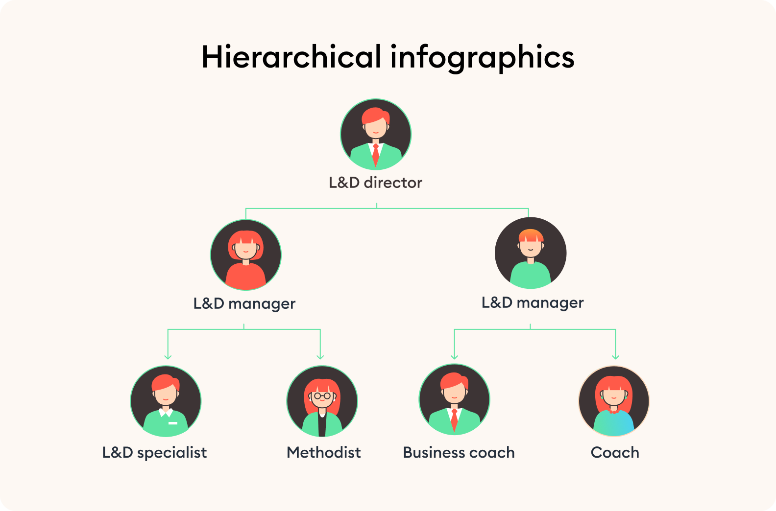
When you need to show structure, rank, or layers of importance, hierarchical infographics are especially helpful. You can use this type to present systems with levels — like organizational charts or pyramid models.
Example: A team lead could build a hierarchical infographic to show the structure of their department or the ticket escalation within a support team.
List-based infographics
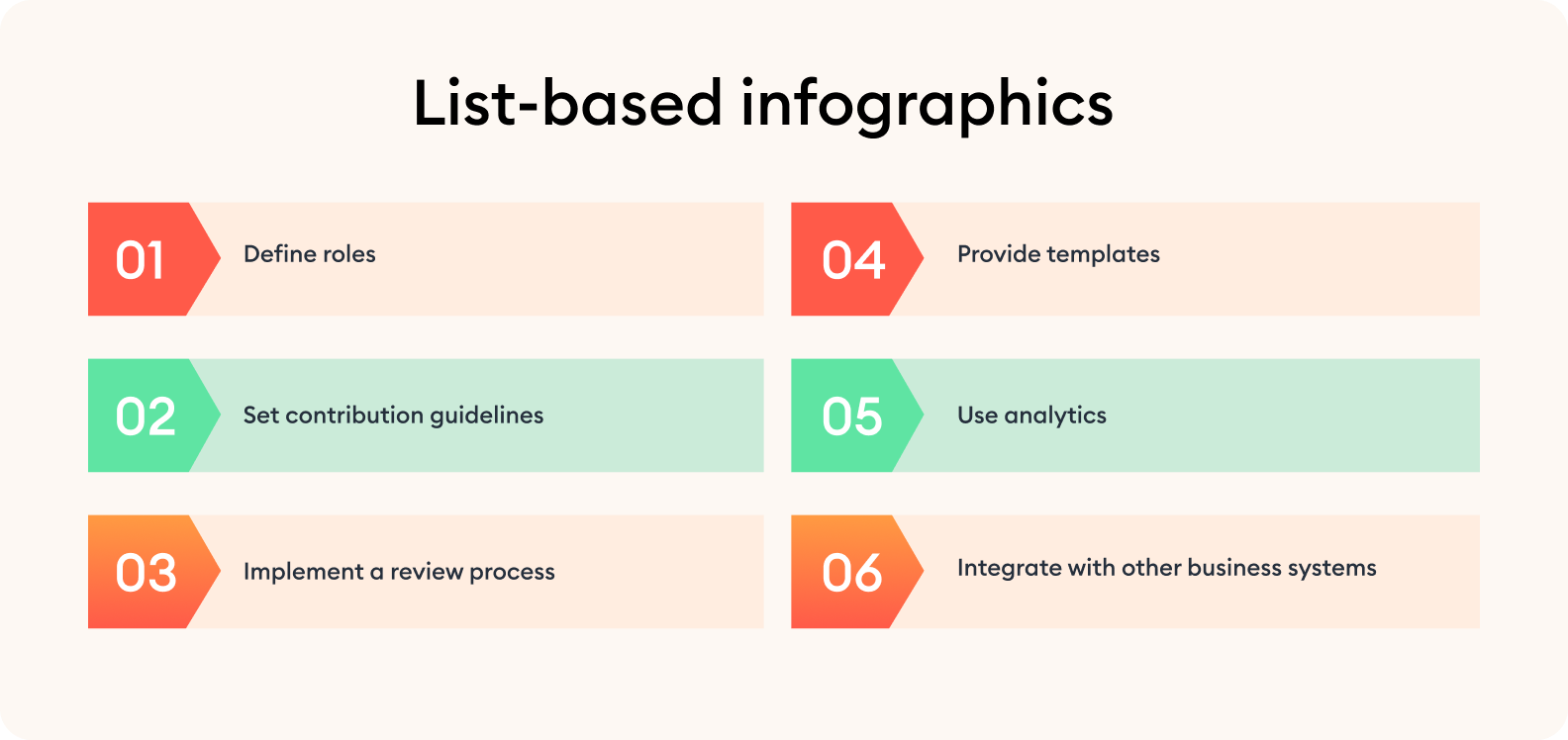
This is one of the simplest and most flexible types. It works best for summarizing grouped ideas, short instructions, or quick tips. You can use it to make your content more readable and shareable.
Example: HR specialists can use list-based infographics during soft skills training to showcase things such as “7 Life Hacks for Preventing Burnout” to provide helpful tips on managing workload, and practicing relaxation techniques.
Each format serves a specific purpose and keeps your content clear and impactful. And here’s the best part: you don’t need advanced designer skills to be able to create an infographic in PowerPoint. Most of us are familiar with this software, and it is more than able to build clean, effective infographics — especially when paired with the right techniques and tools.
To speed things up and stay consistent, a PowerPoint add-in like iSpring Suite can be a great help. It offers infographic templates for each type, grouped by purpose. You can quickly drag and drop infographic elements, customize the content, and stay focused on your message.
Getting Ready to Create Your Infographic
Before jumping into PowerPoint, it’s worth taking a few minutes to organize your thoughts. This small step can make the rest of the process much faster and help you avoid redesigning halfway through.
Start by defining the main idea you want to communicate visually. Whether you’re summarizing data, explaining a process infographic, or highlighting a comparison, having a clear message will help you choose the right structure and infographic elements from the very start.

Consider your audience and think about who will be viewing your infographic and what their expectations or needs might be. Are they looking for a quick overview or a detailed breakdown? Do they already know the topic, or will you need to provide some context and background? Understanding this helps you strike the right tone and avoid overloading the infographic design with unnecessary details.
Once your message and audience are clear, outline the key content you want to include. A simple structure of a PowerPoint presentation with a beginning, middle, and end makes it easier to plan your layout and maintain a logical flow.
Too much to read? Get a summary from AI
Tips on Where to Find Templates and Icons
The quality of your visuals can greatly influence how your message is received. Grabbing random images online might seem convenient, but it often leads to inconsistent infographic design, low resolution, or even copyright issues.
That’s why using dedicated resources with properly licensed, curated content is a much better option — both in terms of visual quality and peace of mind. Here are some reliable sources that will save you time and help you keep your design clean and on-brand.
iSpring Suite
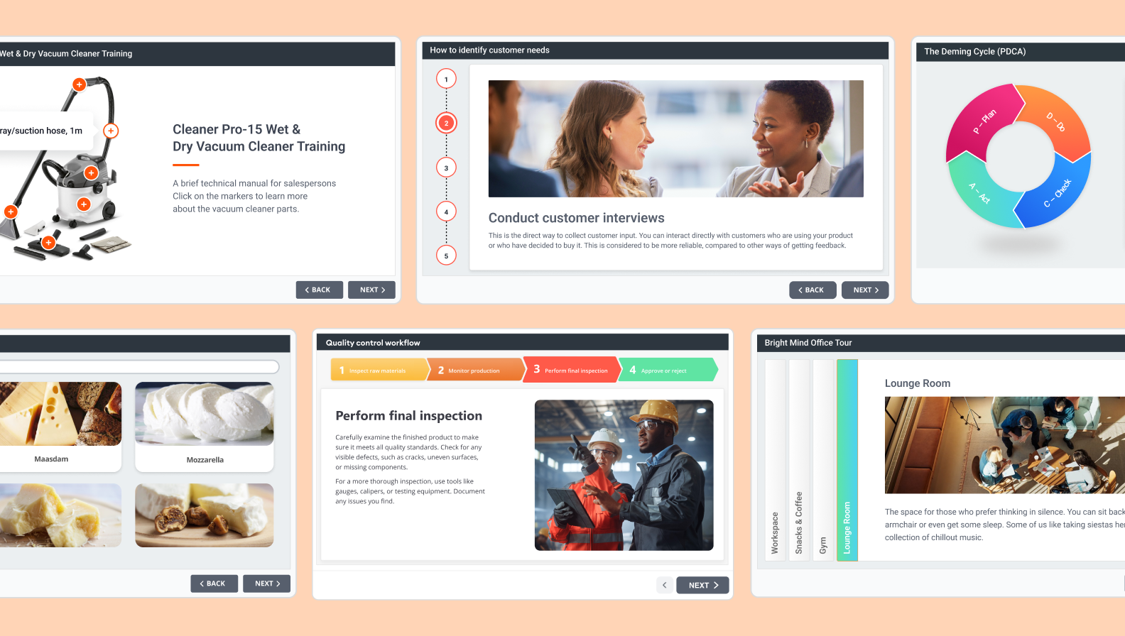
iSpring Suite lets you save repeatedly used elements, create infographics, and access a built-in media library with licensed icons and characters. With this tool, you can skip the time-consuming search for visuals and focus on the data story itself.
Slidesgo
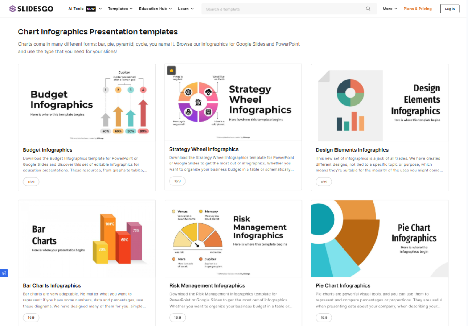
Slidesgo is a go-to site for free templates, including infographic templates for PowerPoint presentations. Here, templates come with pre-styled layouts, editable icons, and balanced color schemes. It’s perfect when you want a polished, professional infographic look without starting from scratch.
Microsoft Create
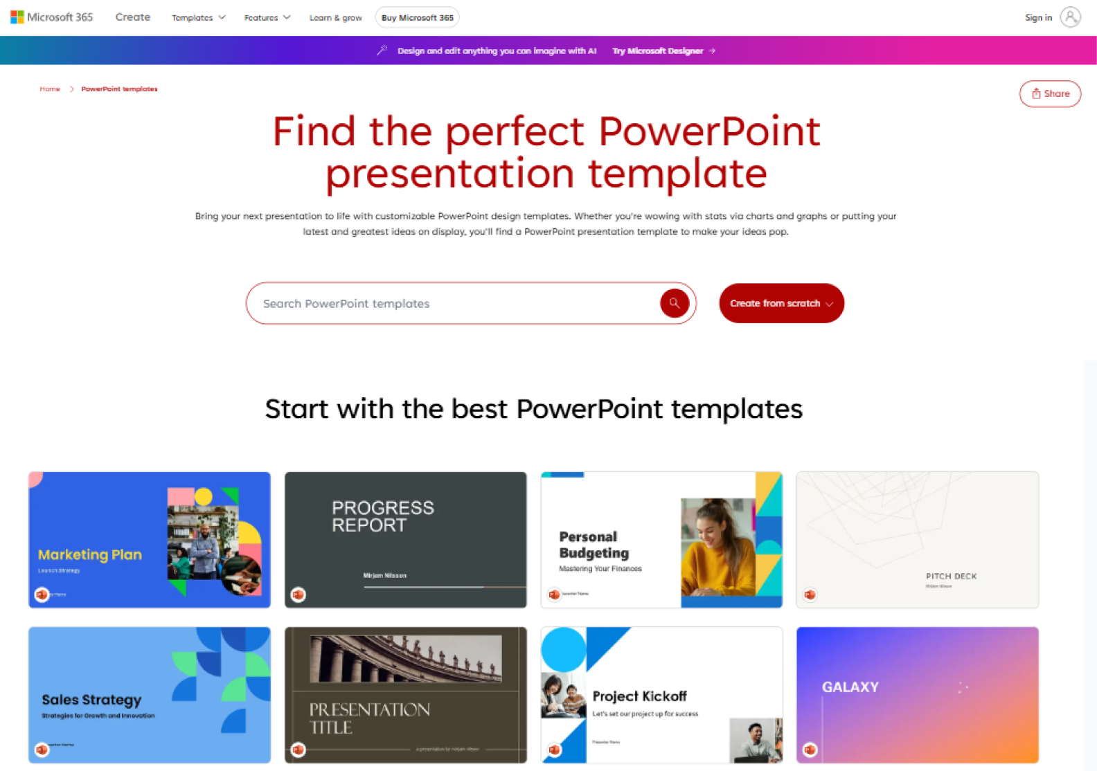
This is Microsoft’s official template library, so everything is fully compatible with PowerPoint. The designs are clean and functional — which is great for business use or educational purposes. You’ll find a variety of infographic formats like timeline infographics, comparison slides, and visual lists, helping you ease your journey on how to create an infographic in PowerPoint quickly.
SlideEgg
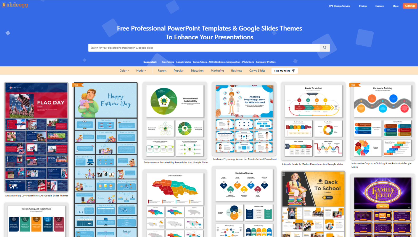
SlideEgg has a strong focus on infographics and offers both free and premium infographic templates. The site features designs for business, marketing, and project management. If you need something industry-specific or data-heavy, this is a great place to explore when creating infographics that include graphs, bar charts, or complex ideas.
Flaticon
Being one of the largest icon databases online, Flaticon offers thousands of free icons in consistent styles — flat, line, filled, etc. You can download them in PNG or SVG and customize the colors to match your color scheme or theme. Flaticon is ideal for replacing bulky visuals with clean, scalable symbols that can enhance your PowerPoint infographics.
Unsplash
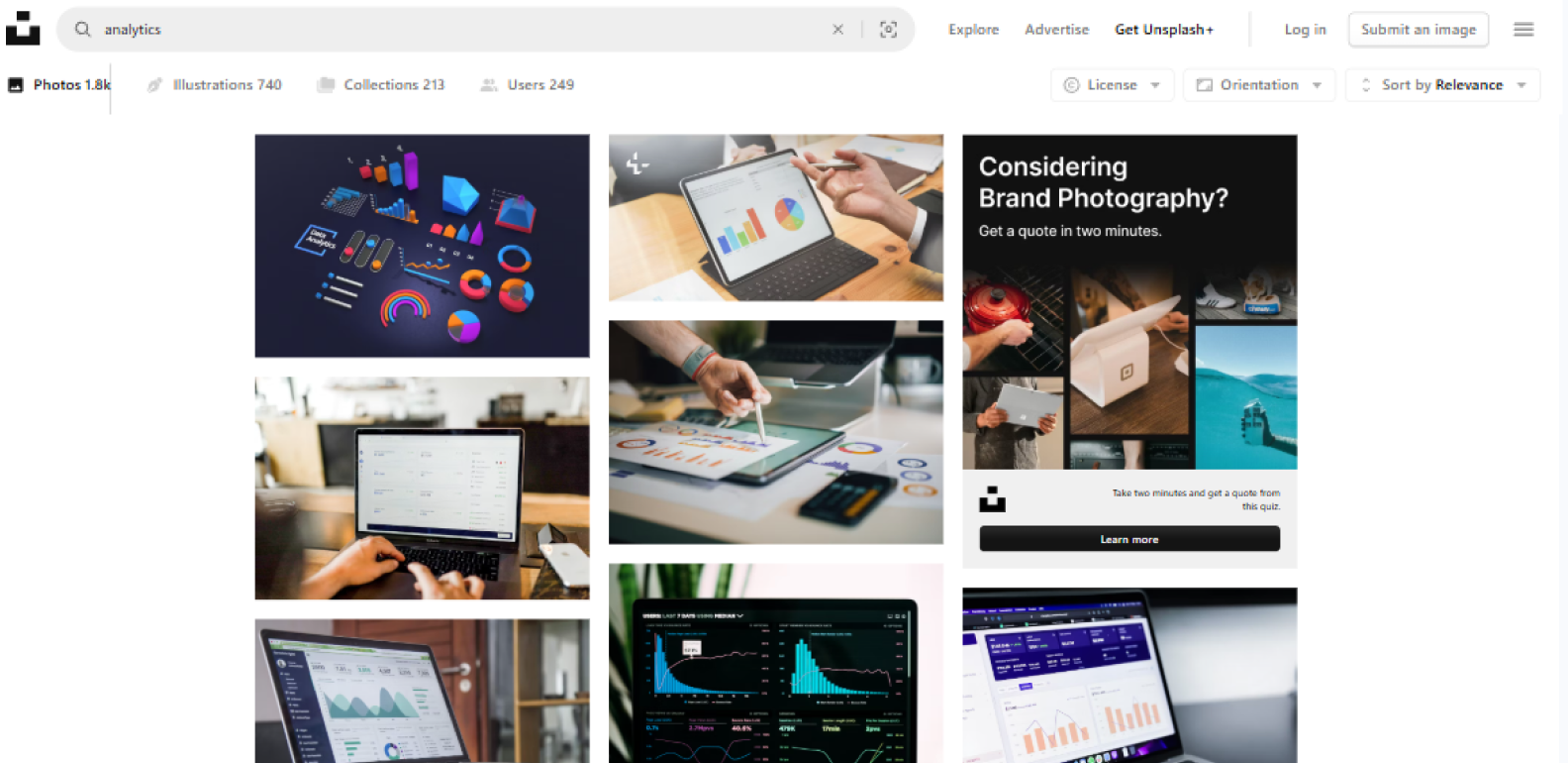
Unsplash is known for its high-quality, royalty-free stock images. It’s also great for finding abstract backgrounds or minimalist images that support your message without adding clutter. Most images are free to use and come in high resolution, making them perfect for large-format PowerPoint slides.
All these resources will help you work faster by giving you access to a reliable, extensive library of ready-made assets. That means you can spend more time telling a visual story and less time designing from scratch, especially when using your preferred design software, such as PowerPoint or Google Slides.
How to Build an Infographic in PowerPoint Step-by-Step
Even if you’ve never designed an infographic before, PowerPoint gives you all the tools you need to create an infographic from scratch — or with the help of ready-made free templates. Here’s how to do it step by step.
Set up your slide
Start by deciding on the orientation. A portrait layout (vertical) works well for infographics — especially if you plan to share it online or print it.
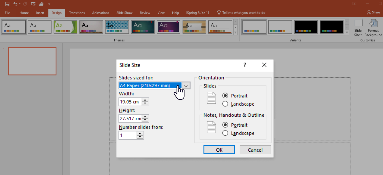
- Go to Design → Slide Size → Custom Slide Size.
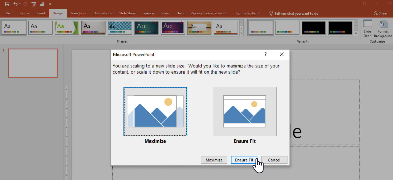
- Then, choose Portrait and set custom dimensions (e.g., 1080×1920 pixels for social media, or letter/A4 if you plan to print for recipients in or out of the US/Canada respectively).
- Click on OK, and then choose Ensure Fit. This is an important first step when learning how to create an infographic in PowerPoint.
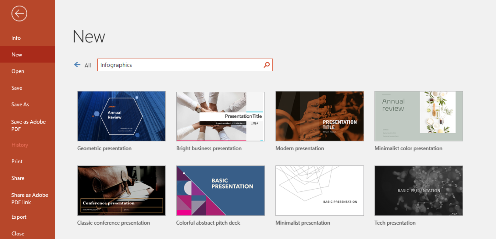
If you want to save time, you can use a pre-designed infographic template. To access PowerPoint’s built-in free templates, go to File → New Presentation and search for “infographic.
Add structure and elements
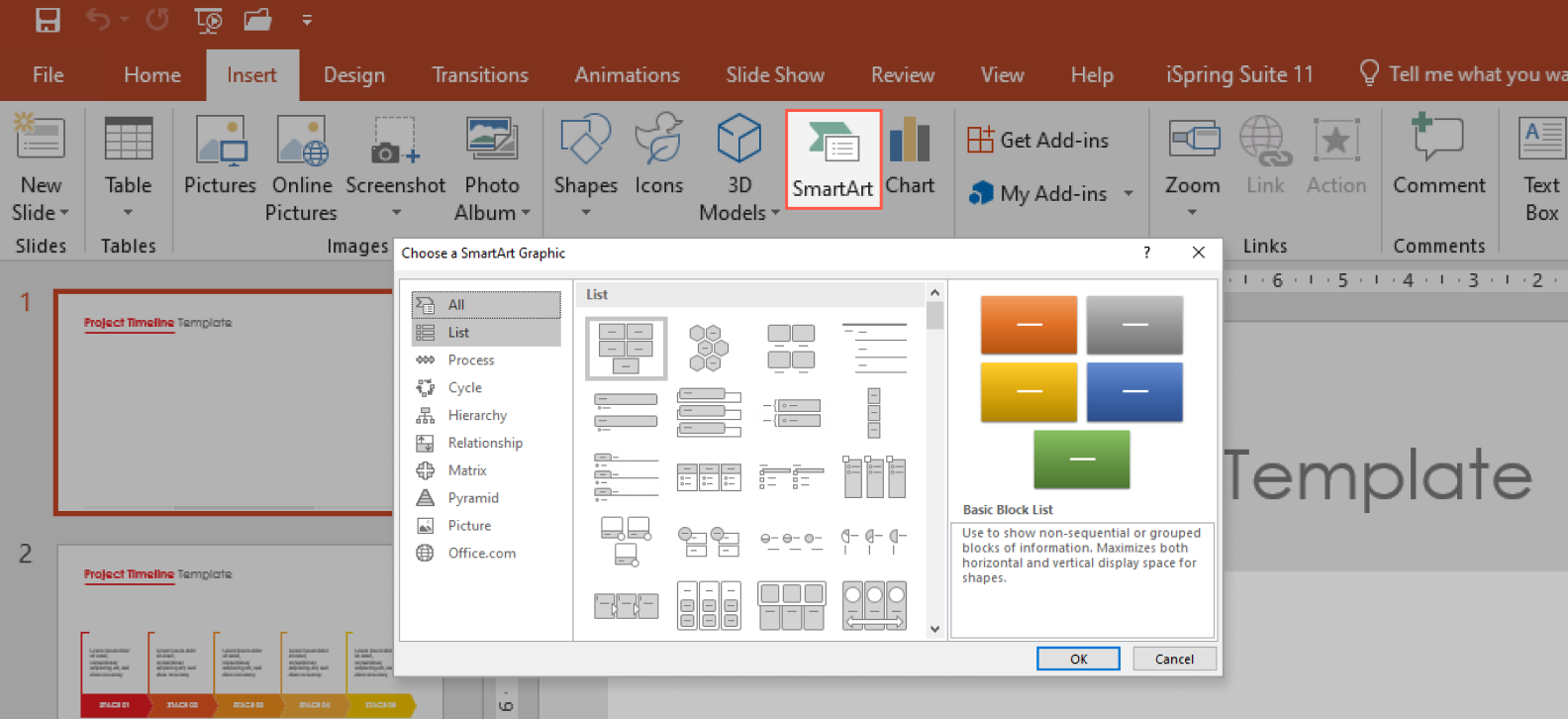
Start building the layout: add shapes, text boxes, SmartArt, and icons. These are your core infographic elements. Use Insert → SmartArt for flowchart infographics, diagrams, workflows, or lists; this saves time and ensures alignment.
Use Insert → Shapes for custom layouts. Hold Shift while resizing to maintain proportions. Use Align tools in the Shape Format tab on the top menu to keep your layout clean and consistent with your color palette.

Apply a visual style
Pick a consistent color scheme that supports your message. Use Design → Variants → Colors → Customize Colors to create a theme — great for branding or maintaining a visual story.

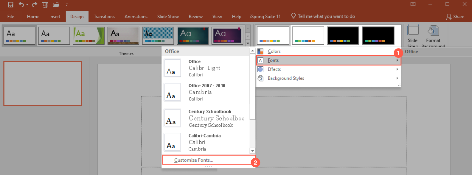
Choose 1–2 fonts max (e.g., a bold header + readable body font). Go to Design → Fonts → Customize Fonts to save your combo.
Use Insert → Icons (available in Microsoft 365) or paste in SVGs from sites like Flaticon for scalable graphic elements. These tools help ensure that you’re making visually engaging and professional infographics.
Insert your data
Add text content and numerical values. If you’re including charts, use Insert → Chart, pick the appropriate type (bar, pie charts, line), and enter your data set in the linked Excel sheet.
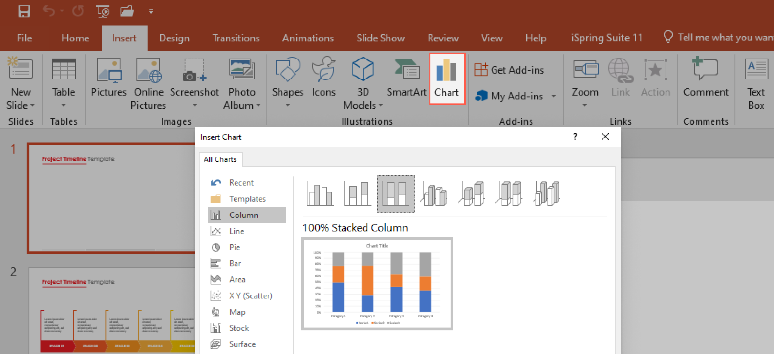
Make sure all labels are clear and keep only the most relevant data points — this isn’t a spreadsheet. The goal is to visualize data, not overwhelm with numbers.
When done correctly, this step helps to present data clearly and support your data-driven story.
Enhance visuals
Add photos or illustrations that support your message. Use Insert → Pictures → Stock Images (if using Microsoft 365) or insert downloaded visuals from Unsplash or other libraries.

Use visual hierarchy — make key info larger or bolder to draw attention where needed. This is key to displaying complex data in a digestible way and contributes toward creating infographics effectively.
Review and adjust
Pause for a few moments and check spacing, alignment, and overall flow. Ask yourself: Can someone understand this at a glance? Use Guides and Gridlines on the View tab to align everything neatly. This is especially helpful when refining your PowerPoint slides.

Export and share
When your infographic in PowerPoint is ready, export it as a high-quality image or PDF:Go to File → Save As → choose PNG or PDF, then click on Options to set the resolution (select “High fidelity” if it is to be viewed online or 300 DPI if it will be printed).
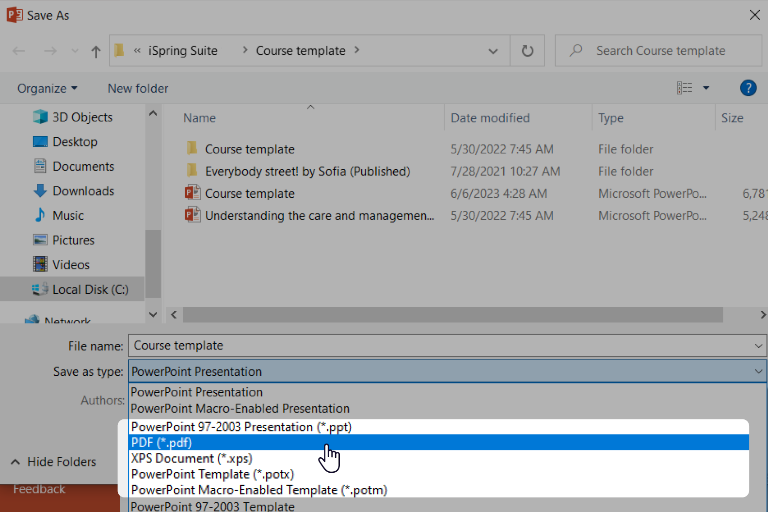
Now you’re ready to upload it to a landing page, attach it to an email, or post it on social media. This makes your infographic useful across platforms like websites, courses, or PowerPoint presentations.
Pro Tips for PowerPoint Users
If you’re already comfortable with the basics of PowerPoint, here are a few advanced tricks to smooth out your infographic creation workflow:
- Use Slide Master to create reusable layouts, especially if you’re designing a series of infographics with the same structure. Go to View → Slide Master, customize your layout, and apply it to all slides with a single click.
- Create a custom theme with brand fonts and color palettes via Design → Variants → Colors/Fonts → Customize. This ensures consistency and saves time when creating your next infographic.
- Group and layer content more efficiently with the Selection Pane (Home → Arrange → Selection Pane). You’ll get full control of overlapping elements — which is especially useful for dense layouts or timeline or flowchart infographic formats.
- To make your PowerPoint infographics more interactive, add Action Buttons (Insert → Shapes → Action) that trigger pop-ups or link to other slides. This is especially handy in learning materials or clickable reports that involve complex ideas.
- Remember to add Alt Text to your visuals (Right-click → Edit Alt Text). This helps users with screen readers and also supports SEO if you publish the infographic online.
If you’re using iSpring Suite, you can simplify a lot of this process. It offers themes and slide backgrounds, along with ready-made infographic blocks, grid layouts, and PowerPoint templates. You can also add interactivity like tooltips, clickable hotspots, timelines, tabs, and FAQs — making your infographic not just informative but more engaging. It’s a great way to turn quantitative data and qualitative data into something much more visually appealing.
Adapting Your Infographic for Different Formats
Once your PowerPoint infographic is ready, think beyond just presenting it on a slide. Adapting it for different formats helps extend its value and reach a wider audience.
For social media, resize your infographic to vertical dimensions like 1080×1920 px and simplify the content. Use fewer words, larger fonts, and more visual emphasis — mobile users scroll quickly, so clarity is most important. This is a great way to reuse blank presentation space for mobile-first design.
If you’re preparing the infographic for print, make sure to increase the resolution during export (300 DPI) and use standard paper sizes like A4 or US Letter. Check legibility: small text that’s readable when viewed on screen may look blurry when printed — especially the case with categorical data or graphs.
For online courses or eLearning modules, keep the infographic modular — each part should be understandable on its own. Tools like iSpring Suite help you turn these sections into clickable, interactive objects, so learners can engage with content step by step. It’s perfect for showing survey results or presenting process content graphically.
And when using infographics in business reports or internal communications, keep branding consistent. Include your logo, use corporate fonts/colors, and export to PDF for easy sharing and printing.
By thinking ahead about format and context, you’ll ensure that your infographic doesn’t just look good, but it also works well wherever it’s viewed, whether it’s part of Google Slides, a new presentation, or your preferred design software.
Best Practices of Data Visualization
Good infographic design isn’t about packing as much content in as possible. It’s about guiding the viewer’s eye and helping them grasp key points quickly. Keep your layout clean and uncluttered. Stick to a consistent color palette for infographics and layout style across the entire presentation so the visuals feel connected.
Fonts also matter more than many realize: choose typefaces that are readable, easy on the eyes, and match the tone of your message, whether it’s formal, educational, or conversational. If you’re using icons or illustrations, make sure they support the content rather than distract from it. This is especially true for comparison infographics, where clarity and structure are critical.
When it comes to visualizing data, the right chart type makes all the difference. Use bar or column charts to compare values, pie charts to show parts of a whole, and line graphs to display trends over time. And don’t underestimate the power of white space — it helps your content ‘breathe’ and makes key information stand out.
If you’re working in iSpring Suite, many of these design choices become much easier. It helps keep your PowerPoint infographic design polished and professional without having to spend time tweaking every detail manually.
Common Mistakes to Avoid
Even simple infographics can go wrong if you’re not careful with structure and visuals. Here are some of the most common pitfalls — and how to steer clear of them.
Overloading the slide
Infographics should simplify, not overwhelm. Too much text or too many icons make the message harder to follow. Instead, focus on one idea per section and maintain plenty of white space. This is especially important in list infographics, where too many bullet points can cause visual clutter.
Poor readability
Fonts that are too small, overly decorative, or inconsistent make your infographic hard to scan. Stick to clean, readable fonts, and make sure your contrast (text vs. background) is strong enough. This becomes even more important when preparing a high-resolution infographic for print, as low contrast typefaces can result in blurred content.
Lack of visual hierarchy
If everything on the slide looks the same — same size, same color — the eye doesn’t know where to look. Use size, weight, and color with the intention to create a clear path through the content. Features like iSpring Suite offer tools for creating infographics to simplify this step.
Forgetting to adapt the infographic to the final format
If you’re sharing it on social media, make sure it’s optimized for mobile (taller layout, larger text). For printing, use a high-resolution export and check its legibility on paper. Always choose the best PowerPoint size for the infographic, depending on where it will be shared.
Too much animation
This can be a source of distraction. A few subtle transitions are fine, but don’t make every icon spin or bounce — it shifts focus away from the message. This is especially critical for data visualization in PowerPoint, where clarity should always come first.
Frequently Asked Questions (FAQ)
Before you dive into creating infographics, here are answers to some questions I often hear — they’ll help you avoid common mistakes and get better results right away.
Can I animate an infographic in PowerPoint?
Yes, and it’s easier than you think. You can use built-in animations and Morph transitions to bring your infographic to life. It’s great for step-by-step reveals or storytelling-style PowerPoint presentations. This works particularly well with interactive infographic design to engage your audience.
Can I post it on social media?
Sure, save it as a PNG or JPEG and upload it to LinkedIn, Instagram, or wherever your audience is. Just make sure your text is large enough to read on smaller screens, especially if the infographic is tall. Using a PowerPoint to PNG infographic export gives you the right format for this.
What’s the best PowerPoint size for an infographic?
It depends on where you’ll use it. For social media, go with 1080 x 1920 pixels (portrait). For print, try A4 or US Letter size. You can set this in Design → Slide Size → Custom. Choosing the best PowerPoint size for an infographic makes it much easier to adapt later.
How can I make an infographic faster?
Using tools like iSpring Suite can speed things up dramatically. It offers pre-built infographic templates, grouped content blocks, and reusable layouts — so you’re not building every element from scratch. It’s ideal for drag-and-drop infographic tools that save time and ensure visual balance.


