How to Create an Online Course: A Comprehensive Guide


Are you planning to create an eLearning course? Or maybe you’ve already started and realized it takes more than a great idea to put it together? In any case, we’ve got you covered.
TL;DR
The article explains how to create an online course from planning through publishing. It guides readers through understanding audience needs, defining goals, outlining and storyboarding content, writing scripts, building course materials with tools like iSpring Suite inside PowerPoint, adding media and assessments, applying UI/UX best practices, ensuring accessibility and mobile readiness, and finally publishing the course to platforms such as iSpring Cloud, LMSs, or the web.
How to Create an Online Course in 12 Steps

Michael Sheyahshe, Technologist at alterNative Media
This guide is a recap of a series of webinars with Michael Sheyahshe, an eLearning expert with over two decades of experience. In this series, he provides a professional step-by-step approach to the entire eLearning course development process, from setting goals and defining the audience to publishing the content.
Read on to learn all about it, or get a free PDF guide on how to create an online course to have it at hand at all times:
Now, let’s dive in.
Step 1. Do some prep work
Your eLearning course development process will only be as productive as your pre-planning, which will prevent potential problems.
- Define the online course objectives;
- Identify the target audience;
- Choose the eLearning platform and course content authoring tool.
Evaluate the demand
If you are an instructional designer in corporate training, you probably don’t have to worry about the demand for your course. However, HR managers and L&D specialists still need to understand whether employees actually require training and precisely which type.
Also read: How to Conduct a Training Needs Assessment (+ Template)
Freelance educators and everyone planning to sell online courses, on the other hand, need to concern themselves with market demand.
To make sure there is a potential audience for the course you plan to create, do some market research. Without going into too much detail, you can start with the following:
- Check out course marketplaces and learning platforms (Coursera, Udemy, etc.) for courses on similar topics. Are they popular? What are their ratings? What do students say about them?
- Search online forums and social media for discussions on topics relating to your area of expertise. What do people want to know? Are they specifically looking for quality courses on these topics?
- Research your competitors. Are other experts already offering online courses on the same or a similar topic? How are they performing?
This will help you make sure people actually want to learn what you want to teach and will inform your promotion strategy later on.
If you verify there is high market demand for the kind of online course you plan to create, you can start building it.
Define training goals
This doesn’t necessarily mean making a list of objectives that you can often see at the beginning of any presentation. This is about the learning outcomes you want to achieve after your learners complete an online course. So, define the purpose of the course by asking, “What should a learner be able to do after finishing the course?”

A learning outcome is what you want a learner to be able to do after completing an online course.
Besides, clear goals will help you market your online course because most prospective learners want to understand the exact learning outcomes.
Also read: Learning Goals and Objectives in eLearning Course Design
Identify your target audience
Trying to create a one-size-fits-all online course is a wasted effort. Instead, tailor your course content to a certain audience that can truly benefit from it. Before you get started with training development, take a closer look at your prospective learners.
Here are some essential questions to answer:
- How many learners will you probably have? For corporate training programs, get this information from managers; for other courses, assess audience volume using marketing research (more on this later).
- What is their position? If you work for a corporate client, are your prospective learners sales representatives, customer service agents, HRs, or anything else? If you produce courses for a wider audience, where are these people professionally, and what do they do?
- What are their demographic characteristics? These include average age, gender, education, geographic location, computer literacy, and other relevant characteristics.
- Have the learners received prior training in this area of expertise? The answer will help you understand how well they know the topic and what their current skill and knowledge level is. This information is vital for making the course content relevant and useful to your audience.
- If possible, survey your potential audience. Ask people how likely they are to take the course you plan to create, their expectations, and pricing preferences.
Additionally, think about whether learners with disabilities will be taking the course. This is especially important in corporate training where learners are already known, but it’s also relevant for eLearning as a whole. If you plan to teach learners with disabilities, you’ll need to tailor course content accordingly right from the start.
At this point, you can use the popular marketing technique of creating a marketing persona — a collective image representing your target audience. This persona should have all the key characteristics you’ve defined in the course of your previous research and be as detailed as possible. You can even give them a name. In fact, marketers often do that.
It may also help to segment the audience. That is, divide it into groups based on certain common characteristics like education level, prior training, etc. This is especially relevant for independently marketed courses, but can also apply to corporate training in some cases. If you have a large enough audience and choose to segment it, also create a separate marketing persona for each segment.
Choose the best online course platform or delivery channel
The next thing to consider is how you’ll deliver your course to the audience. The way you distribute the eLearning content will define the choice of the course format (video, SCORM, etc.) and the type of software you’ll need.
Some ways to deliver an online course effectively are:
- A learning management system (LMS)
- A dedicated group or channel on social media or community-based platforms (Facebook, Discord, Slack, etc.)
- A channel on a video hosting platform (mostly relevant for free courses and short marathons)
- A chain of emails
- A dedicated website/online store
- Course marketplaces, and more
If you’re going to train employees, the easiest and most comfortable way to manage the learning process is with the help of an LMS. It will allow you to automate a number of functions like invitations, course assignments, and result tracking, plus it supports live sessions for blended learning.
If you’re going to become a successful eLearning course seller, opt for a platform that allows you to host, deliver, and sell learning courses to end users seamlessly. Plus, such platforms usually help you manage everything from building the course to marketing, payment processing, and handling transaction fees. Some eLearning platforms like iSpring LMS offer built-in e-commerce features.
In both cases, modern learning platforms usually allow for building an online community around your course. This facilitates online classes, helps foster engagement and gather feedback, and increases customer loyalty.
Select an eLearning authoring tool
This is the main tool you’ll use throughout the entire development process. If you’re new to eLearning design, you’ll need to choose an easy-to-use tool that will allow you to create eLearning courses as quickly as possible, while also satisfying all of your authoring needs.
If you want to create interactive courses with quizzes, video content, and dialogue simulations, you’ll need authoring software that’s a single set of tools under one roof, covering a variety of course activities.
Check out what a course made with the iSpring Suite authoring tool looks like:
iSpring Suite AI
Build a high-quality course with interactive elements, but without a steep learning curve.
No training required to start!

Step 2. Organize the work with experts and stakeholders
When developing an online course, you need to cooperate with both subject matter experts (SMEs) and stakeholders.
For example, if you’re developing eLearning training courses for a sales team, you may need to collaborate with the managers and executives from sales and HR departments, the CEO, and admins.
You’ll need to decide on the content together with the SMEs and meet the stakeholders’ requirements. However, no matter what your stakeholders say or what your content is, your true mission is to do what’s best for your learners.
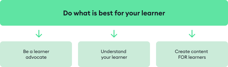
This includes:
- Being a learner advocate. Support your learners in every way to help them achieve the best possible outcomes.
- Understanding your learners. Know their preferred learning styles, habits, time constraints, content preferences, etc.
- Creating learner-first content. Making choices that will make the learning experience comfortable and engaging while also providing valuable outcomes for the learners.
But what if you’re creating a course independently to sell online and are an expert on the course topic? Should the course creation process still involve an SME? Probably not, but you might need to get your course content reviewed by an instructional designer.
To see how your ideas can come to life, check out our video “How to Use PowerPoint for Online Courses in 2026”. In this tutorial, Anna Poli, Senior eLearning Developer at iSpring, walks you through planning, designing, and publishing professional eLearning content using PowerPoint:
How to Use PowerPoint for Online Courses in 2026 | Step-by-Step Tutorial
Step 3. Make a course outline
So, you’ve collected all the necessary materials for your online course. Next, it’s time to create a clear course structure to organize the content in a logical and learner-friendly manner. This structure will be your course outline. To help you get started, download a free course outline template.
Next, take all the course materials and break them down into topics. These will be your training modules — accessible, digestible chunks focused on one aspect at a time. If you’re planning to create a lengthy course, break the more general topics into subtopics.
Arrange the topics so they flow logically — from basic concepts to more complex ones, for instance.
If the course covers several topics that can be studied independently, you can sequence them by themes instead. In this case, just make sure each course topic (module) aligns with the overall learning goal.
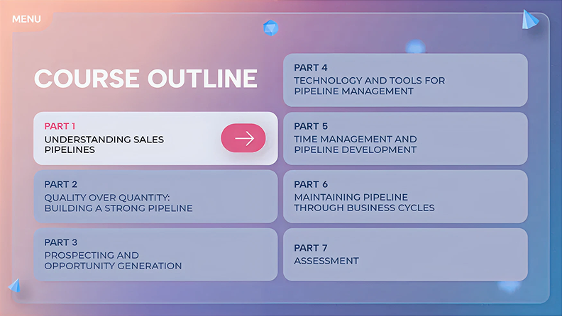
An example of a course outline
Too much to read? Get a summary from AI
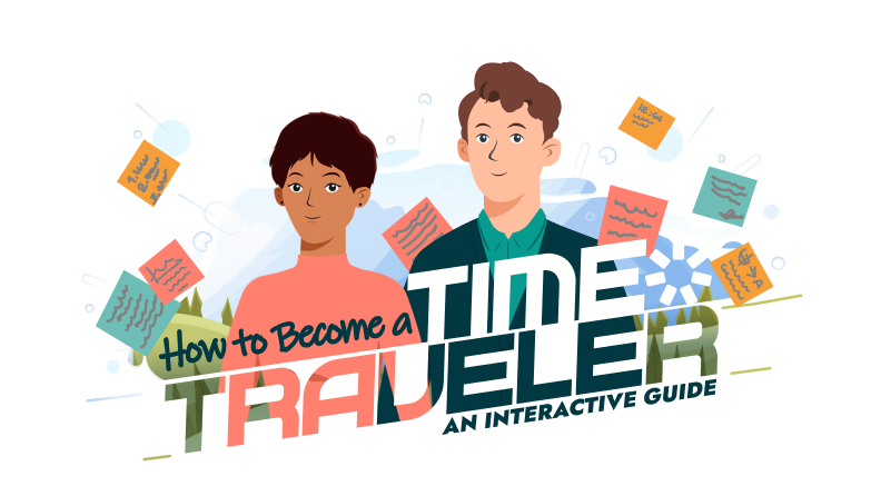
Step 4. Create a storyboard
Now that you’ve divided your course into training modules and subtopics, you need to lay out the framework of the course visually. This is called storyboarding. You can create a course storyboard in a document, slide deck, prototype, or whatever you prefer.
In addition to the text content that we’ll discuss in detail in the next step, the storyboard also typically includes all other course materials: photos, icons, charts, infographics, animations, videos, etc.
At this stage, it’s also important to prepare all the necessary assets you’re planning to use in your course. You can find some online, while others will probably be in your authoring tool library, and some you may need to produce or outsource. In any case, this is time-consuming, so it’s best not to delay this task.
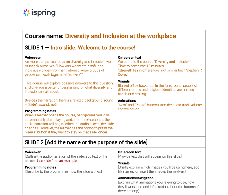
Example of a storyboard in MS Word
This is what you can include in an eLearning storyboard:
- Slide title/name
- Screen text and elements (see next step)
- Graphics and animation
- Navigation
- Branching (how learners will move between slides or slide sequences based on their actions)
- Audio narration script
While there is no one-size-fits-all solution, there are some industry-standard methods for storyboarding that you can adapt to fit your needs. To streamline the process, download the ready-made Word storyboard template and customize it.
Step 5. Write a script
Now that you have your online course outline, it’s time to write a script. A well-prepared script serves as the backbone of your eLearning course design and helps turn the subject matter into engaging learning content.
Typically, course designers have to deal with two types of scripts: on-screen text and narration scripts. There are different practices for writing them, so let’s take a look at each type separately.
On-screen text
This is all the text a learner sees on the slides. Here’s how to make it really helpful:
- Add only core concepts to the slides. If you want to provide additional information, you might record a voiceover or support the text with images, infographics, and/or videos.
- Minimize the amount of text on a slide. Large blocks of text are tiring to read, so be as concise as possible. Remove unnecessary words and break down complex sentences: ideally, one line should not be longer than 40 characters. Here, the main rule is “one screen = one idea”.

- Make sure the content looks good on small screens. The text, as well as other content items, must be clearly visible on any device. Keep this in mind when creating a course and check how it looks on a smartphone at the end of the eLearning development process.
Narration script
A narration script is a text that learners hear, not read. If you’re not going to include a voiceover in your course, you can skip this step.
If you are planning to add narration, the main task is to make it listener-friendly. To do this, approach it as a conversation. The idea is to help learners feel like they’re interacting with an actual person. To do this, stick to a conversational tone and avoid complex sentences, acronyms, and jargon whenever possible.
After your script is ready, read it aloud. If you hear that you need to replace or remove something to make the speech smooth and clear, make the necessary touch-ups.
Step 6. Pull the content together
At this point, you should already have:
- The course structure (outline)
- All the necessary media, except probably a voiceover or video narration
- All the text content (on-screen text for your slides and a narration script if necessary)
Now, it’s time to gather all the content together and make it into a course.
iSpring Suite works right inside PowerPoint, so if you’re already familiar with it, building a course will feel completely natural. Just add your text, images, and videos to the slides following your storyboard, and your course will be ready to go.
Plus, you can use the built-in AI assistant to speed up your work. You won’t need additional software for all this; all features come with iSpring Suite AI and are ready to use right after installation.

Step 7. Record or add audio and video
Audio and video can be great assets to support the text on the slides. Plus, they help make an online course more engaging.
How to record audio for your course
Now that you have the narration script ready, you can record a voiceover — either on your own or with the help of a professional voiceover artist. If you decide to outsource it, the artist will probably handle the complete process — you’ll only need to provide the text.
If you prefer to supervise the process or record the narration yourself, here are some tips to get the best out of voiceover (VO) recording:
- Find the quietest place possible. If you don’t have a recording studio, you can try to use different locations, like a tiny room, a walk-in closet, or even a vehicle in a garage.
- Try to get as much recording time as you can with your VO artist on the same day. One’s voice can change from day to day, and even from morning to afternoon, so it’s preferable to do as much as possible in one take.
- Use a good-quality external microphone for high-quality audio. Before recording, check if your microphone is properly set up and adjust the settings.
- Prepare your voice for recording. Drink some room-temperature still water and do vocal warm-ups to help your voice sound fuller and cleaner.
After your prep work is done, it’s time to record the voiceover. You can do it right in iSpring Suite. The built-in audio recorder lets you capture your narration, edit your recording, and easily sync it with slide animations and transitions on the slides.
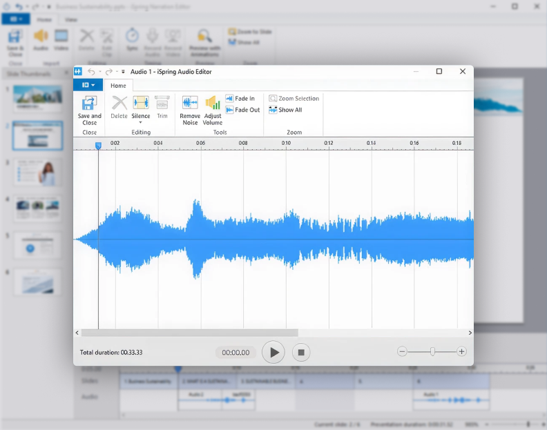
The tool also provides editing options like trimming audio, adjusting volume, removing noise, and even silencing an entire section.
But what if you’re not a good narrator and don’t have a budget for hiring a professional VO artist? With iSpring Suite, you can make a compelling voiceover in minutes. Just add your narration script to its text-to-speech editor, select a language, a preferred voice, and voila, your voiceover is ready.
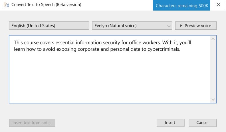
To make the narration more energetic, you can add the desired intonation or pauses and enable SSML (Speech Synthesis Markup Language) Editor.
How to record video for your course
With iSpring Suite, you can also import or record videos: it has a professional video studio that enables you to record your screen with webcam and audio. In addition to screencast recording, it provides all the features needed to make professional-looking, high-quality videos.
In iSpring Suite you can delete unwanted fragments, add titles and captions, insert images and infographics, or create transition effects.
iSpring Suite is equally great for making entire video courses and adding video fragments in specific places throughout your course. For example, you can add a video to demonstrate how to use specific software, walk your learners through a specific process, or explain an incorrect answer in a quiz.
Step 8. Add assessments and knowledge checks
Quizzes and tests are very effective for tracking learner progress, checking knowledge retention, and identifying knowledge gaps.
If you’re creating a course for sale, assessments might not seem essential. However, interactive quizzes can drive learner engagement and help them retain new information longer, so it’s still beneficial to include them in your course.
Practical tip: Many of the best instructional designers develop assessment questions first, and then build the rest of the course content so that it answers those questions.
With iSpring Suite, you can create quizzes easily. Just choose from 14 quiz types, including matching, sequence, hotspot, fill-in-the-blanks, drag-and-drop, and more.
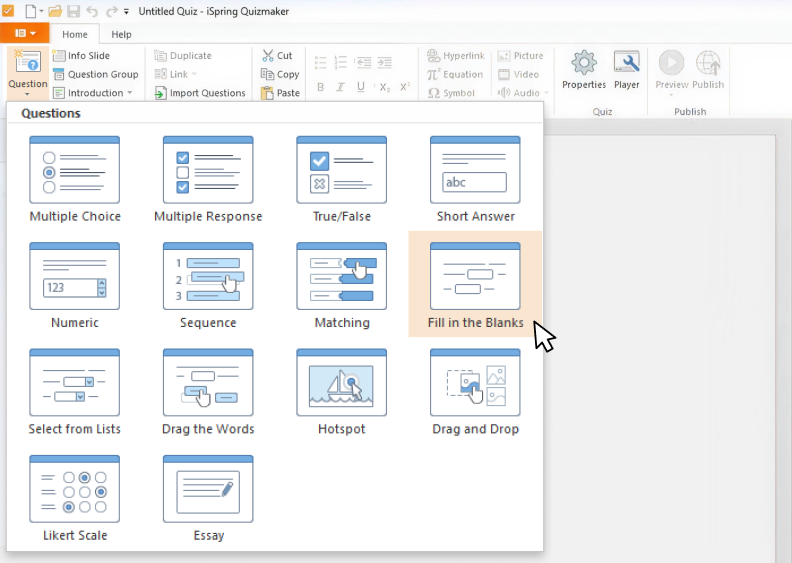
The ready-made question templates will let you build an interactive course in a matter of minutes.
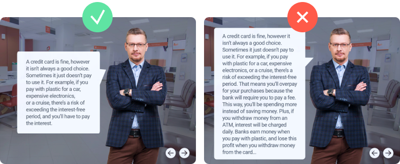
Here’s what an interactive quiz can look like:

Branching
Branching creates a non-linear scenario in your quiz that leads from one slide to another depending on the learner’s answer. For example, when a learner answers a question incorrectly, you send them to an info slide for additional information, while those who answer correctly proceed to the next question.
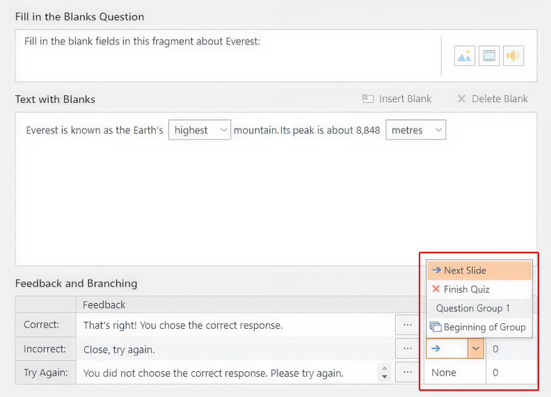
You can set up branching in a couple of clicks.
Video and audio in quizzes
With iSpring, you can enhance a quiz with audio and video. Add video or audio to the questions themselves, to the answers, or incorporate media files into a branching scenario with info slides like the one shown below.
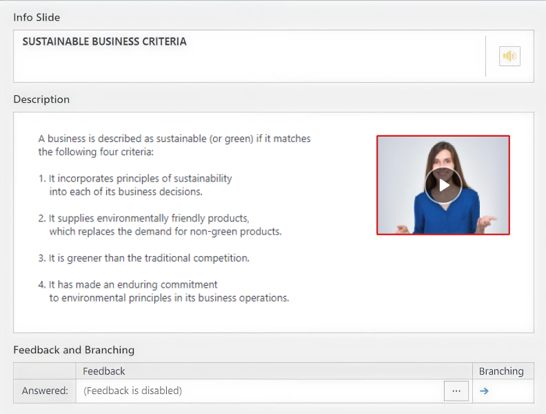
Info slides let you provide more information on a topic.
Quiz design
To make the quiz look appealing and match the overall course layout, you can customize the design of a single slide or the entire course. Set the font, change the layout, and choose a color scheme for the quiz slides in just a few clicks in iSpring Suite.
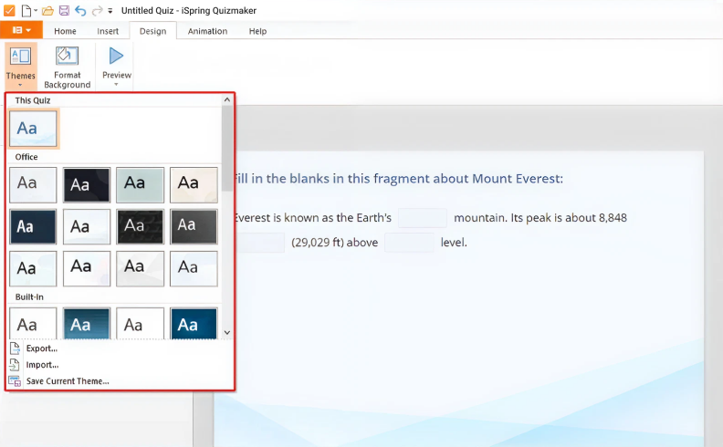
You can even customize the text of the buttons.
When the quiz is ready, you can easily share it with your peers, colleagues, or other stakeholders to get feedback.
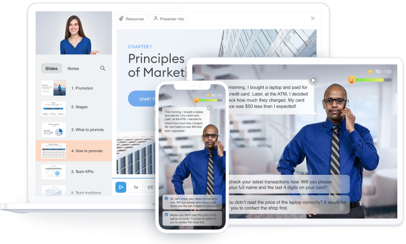
Step 9. Create a role-play
If you’re designing a course for someone who needs to improve their communication skills, try a dialogue simulation. It imitates an actual conversation with a person, helping learners master communication skills in a risk-free, low-pressure environment.
iSpring Suite allows you to make realistic role-plays quickly and easily. This is what a role-play looks like:
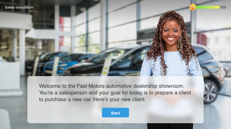
The principal feature of a role-play is its branched scenario, where each decision has consequences. It works like actual communication between people: say something inappropriate, and you might upset your counterpart; be friendly and polite, and they’ll mirror your sentiment.
With iSpring Suite, you can build a dialogue tree – a well-organized structure that you can manipulate with one click.
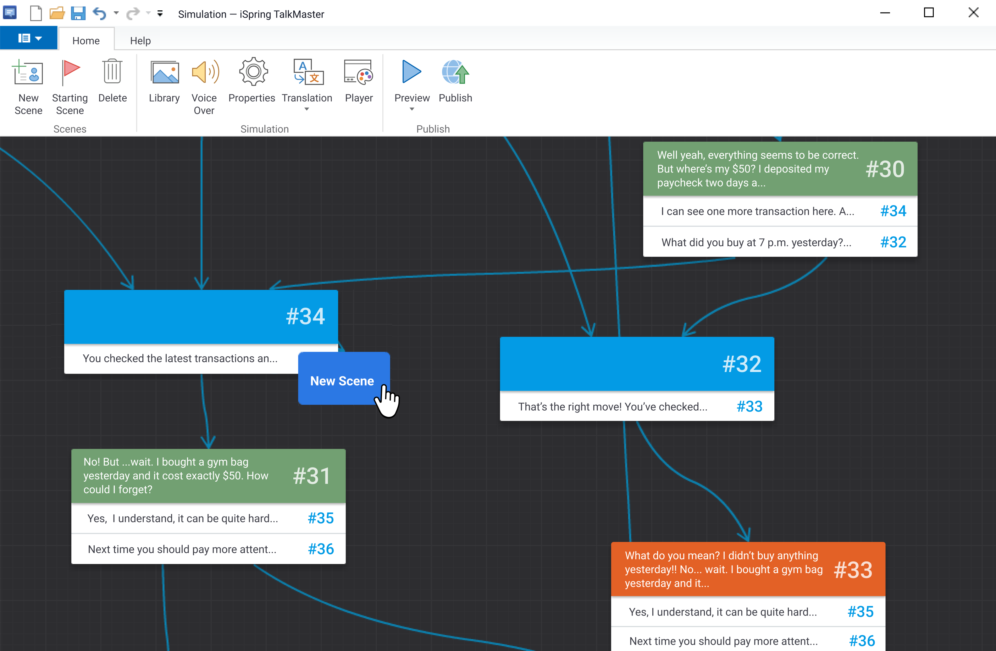
This makes even the most complex branching conversation scenarios clear and organized.
To make a role-play more realistic, you can add backgrounds, voiceovers, and characters to each scene. A great way to save time on course development is to use iSpring Content Library, which offers an extensive set of characters of different ages, ethnic groups, and professions, and a huge collection of locations suitable for different situations. Alternatively, you can upload your own assets.
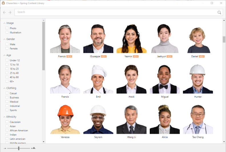
With iSpring’s diverse collection of assets, you can realize your unique vision for any type of course.
Step 10. Apply UI/UX best practices
Even great training content can fall flat if your course looks cluttered. The good news is, with iSpring Suite, you don’t need to be a design expert — you just need to know the main UI/UX practices.
Simply put, UI (user interface design) is what makes an online course visually attractive. It uses the principles of graphic design and typography to bring the UX (user experience design) to life. UX refers to the way an eLearning module is designed to feel for the user, focusing on a smooth experience, ease of use, and learner satisfaction.
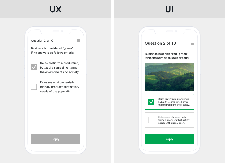
Consider the basic UX and UI principles when creating a course.
As Ken Norton, Partner at Google Ventures, put it using the restaurant analogy,
“UI is the table, chair, plate, glass, and utensils. UX is everything from the food to the service, parking, lighting, and music.”
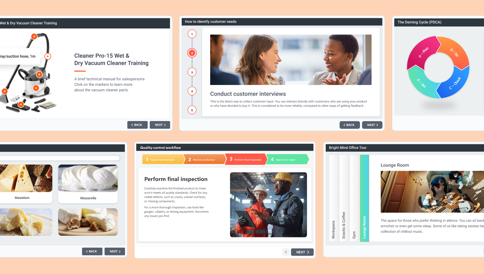
As mentioned, with iSpring Suite, you don’t need to be a UX/UI guru. You can simply use the ready-made eLearning templates from iSpring Content Library, arrange blocks (title slide, chapters, info slides) in the order you want, and add your text and images. Ready-made icons and objects are also available.
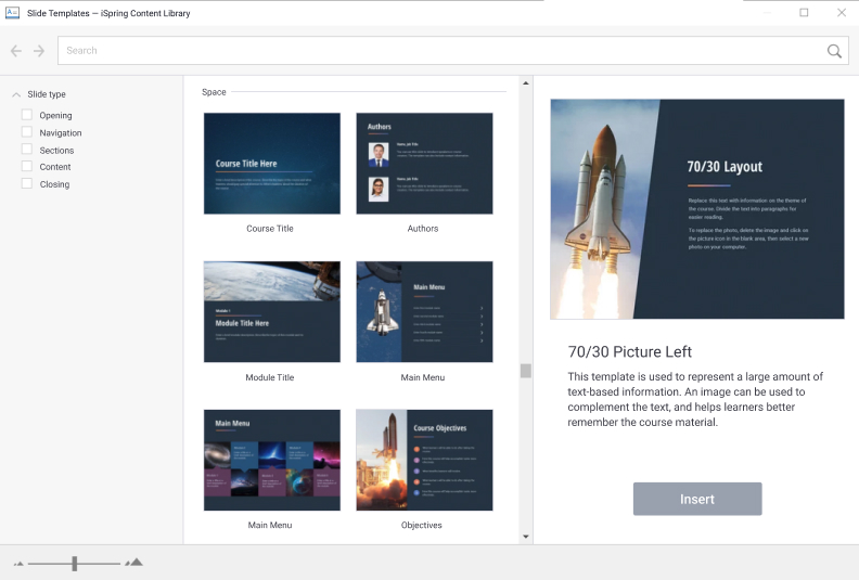
Drag the blocks to where you need them to be, add text and images, and your course is ready to go.
Step 11. Ensure your content’s accessibility and mobile readiness
Do you work for a government agency interested in training employees online, or any other business that aims to make its eLearning fully accessible for people with impairments? Then you need to create courses that comply with Section 508 (in the US) or the European Accessibility Act (EAA) and the related EN 301 549 standard (in Europe).
Here’s how you can make your online course fully accessible.
PPT accessibility feature
It’s convenient to prepare slides for your courses in PowerPoint since Microsoft itself provides ways to make your presentation accessible for learners. For example, you can use a screen reader, alt text, and built-in layouts for images.
Microsoft also provides a built-in accessibility checker. When it’s used, it shows a list of potential accessibility issues with suggestions on how to address them.
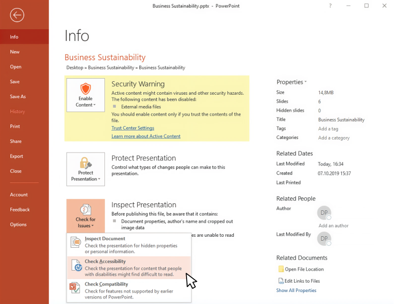
The course creator can fix these issues to make the slides more accessible to those with disabilities.
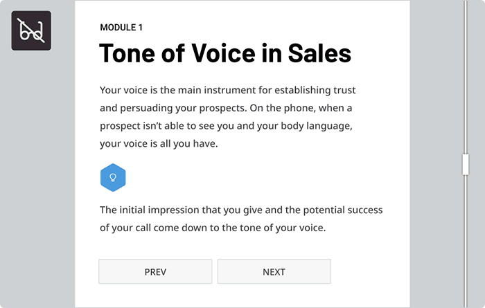
Accessibility standard-compliant content in iSpring Suite
Although the Microsoft Accessibility checker is a great option, with iSpring Suite, you can make courses accessible to individuals with visual impairments much faster and easier. To create accessible training content, you don’t have to develop a separate version of your course, master a new tool, or even invest your time in checks. Just build a course in the respective editor, as you always do, and tick a single checkbox.
Here’s how a course slide looks in different modes:
Mobile readiness
Courses created with iSpring Suite play well on any device, including PCs, Macs, tablets, and smartphones. Before publishing the content, you can preview the course on each device type.
You can see how a course will look on different devices in a few clicks by using the Preview mode.
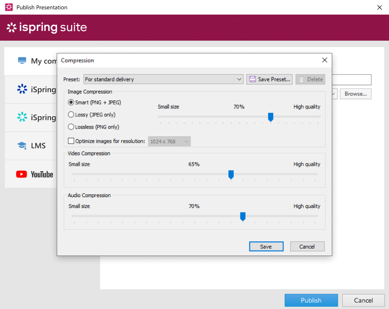
When finalizing a course, make sure the course content isn’t too heavy for the learners’ devices to process. Make it lighter if needed, choosing presets to adjust the levels of graphics, audio, and video compression.
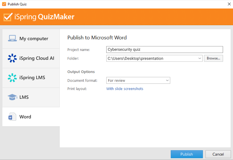
Step 12. Publish your course
Now that you’ve planned, designed, and developed your eLearning content, it’s time to publish your course!
iSpring Suite allows you to publish the content in several ways: to your computer, iSpring Cloud AI, iSpring LMS, other LMSs, and YouTube.
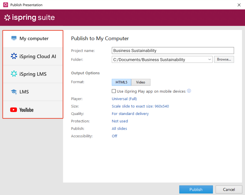
The format you’ll publish your course in will depend on your goals and the platform you’ll use to deliver it.
- For example, if you’re going to share your course on the Internet and showcase it in your blog, choose HTML5.
- If you’re planning to upload it to your LMS and track learner progress, find out which eLearning formats the platform supports beforehand. iSpring Suite supports the main popular eLearning standards that most LMSs work with — SCORM and xAPI.
Just navigate between tabs to use the option you prefer.
Useful resources
Next Steps
At this point, you already know there is high market demand for your online course, and the course itself is ready to launch. So, it’s time to develop your sales and promotion strategy.
Step 13: Promoting and Selling Your Course
Once you’ve done your research and chosen the platform, you need to focus on generating income.
How to monetize an online course
- One-time purchase. A single fee for access, often with variations like tiered pricing or lifetime/limited access.
- Regular subscription. Recurring fees (monthly, quarterly, or yearly); best if you’re offering a selection of courses.
- Club membership. Regular fees for access to a community with additional perks, such as live sessions, ongoing support from mentors and peers, and exclusive materials. This is relevant if you have more than just courses to offer.
- Corporate license. If your course topic fits the needs of one or more organizations, you can offer bulk access to them.
Your ultimate choice will depend on factors like the value you can offer, your platform, your team’s capacity, and audience preferences.
Also read: How to Make Money Selling Courses Online
Online course promotion strategies
To attract learners and generate profit, promotion is key. Here are some key strategies:
- Leverage your existing audience. If you have social media followers, blog readers, and email subscribers, let them know about your course and remind them regularly.
- Craft a sales page. Create a landing page that features all the information potential buyers might want, like course description, outcomes, pricing, social proof (testimonials), and a FAQ section.
- Use content marketing and SEO. Fill your website with useful content and optimize elements like keywords, content quality, and site structure for search engines.
- Launch a paid advertising campaign. Run targeted ads on social media, search engines, and relevant resources.
- Try influencer marketing or collaborations. Partner with experts in similar niches, as collaborations can be a free and effective alternative to expensive paid influencer marketing.
- Run an email marketing campaign. Use an email funnel to promote your course to your subscriber base.
- Host a series of webinars. Conduct valuable live sessions that educate your audience and introduce your product.
- Offer free content as a lead magnet. Provide a free guide, an e-book, a live meeting, a marathon, or even a mini-course to give potential learners a taste of your product.
- Try affiliate marketing and referral programs. Affiliate marketing involves partnering with external promoters who share your sales link and receive a commission for each purchase they generate. Referral programs, on the other hand, reward your existing customers for recommending your product to friends, colleagues, and other connections. Give a percentage of revenue to agents (affiliates) or satisfied customers (referrals) who recommend your course to their connections.
Step 14: Building a Community and Collecting Feedback
Once you’ve launched your course, maintaining a relationship with your learners is crucial. An engaged community supports motivation, fosters loyalty, and provides valuable insights for improvement.
Create and maintain an online community
Provide an exclusive space where they can connect, share experiences, and ask questions.
Here’s how to organize it:
- Platform. Use a private group (Facebook, Slack, Discord) or utilize the social learning features of your LMS (discussion boards, comment threads, live chats).
- Engagement. Show up regularly to answer questions, provide updates, and host live Q&A sessions.
- Value. Offer exclusive members-only content to provide deeper insight into the course’s topic.
Gather learner feedback and improve
Online communities are an excellent way to collect feedback to identify weak spots, refine the course, and gather testimonials for marketing campaigns.
Here are some ways to get feedback:
- Methods. Use surveys or polls, ask open-ended questions about their experiences, and reach out personally to the most active community members to ask for more in-depth feedback.
- Analytics. If your course is hosted on an LMS, the platform may provide detailed analytics that include all key information, such as time spent on lessons, engagement rates, quiz scores, and more. Use it together with feedback collected through a community to get a fuller picture.
Frequently Asked Questions
Here are responses to some questions on creating custom eLearning courses.
1. What types of courses can I create?
We’ll divide the types of courses into two main categories based on the target audience: courses for corporate training and courses for individual clients.
- In corporate training, there are five core types of eLearning courses: onboarding courses, compliance courses, job-specific skills training courses, soft skills training courses, and product knowledge courses.
- Courses for individuals include courses for leisure, hard skills training, personal development, coaching courses, and more. Here, the possibilities are almost endless and depend mainly on market demand.
2. What is the best platform for creating online courses?
There are plenty of options, but professional tools give you the best results. iSpring Suite is a great choice because it works right inside PowerPoint, so it’s easy to use — even if you’re not a tech expert. You can start building and selling polished courses right away.
3. Is it worth creating online courses?
Yes, creating online courses pays off if your content is high quality and you know how to market it. Courses without clear goals or useful material struggle to attract learners and generate income, whether for personal profit or corporate training.
4. How much money can you make from an online course?
Earnings depend on your niche, audience, pricing, and how you promote the course. Beginners tend to make less, but experienced creators with a loyal following can earn much more. Some short courses sell for as little as $10, while professional certifications can go for $5,000 or more.
To Sum Up
That’s it! We hope this guide to the eLearning development process will help you create engaging, effective, profitable, and overall amazing eLearning courses. If you still haven’t checked how easy and fast it is to create online learning content with iSpring Suite, get a 14-day free trial or book a free demo.
Create online courses and assessments in record time.


The 12 Best FREE eLearning Authoring Tools in 2026
How to Create a Training Course Outline (Template Included)
9 eLearning Content Types to Include in Your Training Program
eLearning Standards Comparison: AICC vs SCORM vs xAPI vs cmi5 vs IMS Common Cartridge