September 30, 2014  2 minutes
  868 views
How to create great PowerPoint presentations. Part 2.
We continue sharing with you secrets on creating killer PowerPoint presentations.
If you would like to start reading our collection of simple tips from the very beginning, you’re welcome to take a look at the first part of our essential selection. Learn more about how to use fonts, colors and text boxes in your presentations: How to create great PowerPoint presentations. Part 1. →
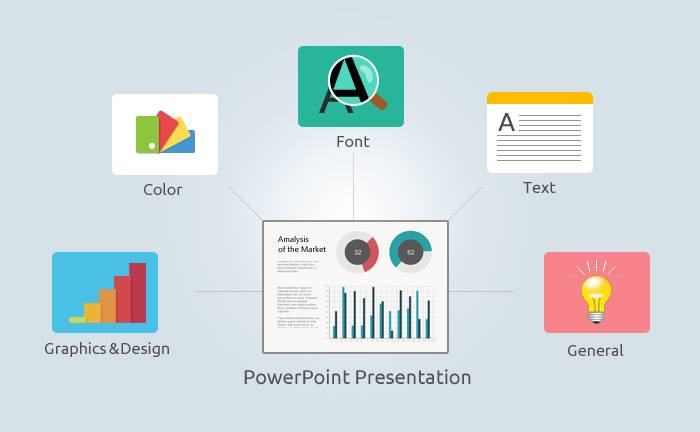
Graphics and Design:
- Your slides should have a lot of “white space”. Overloading them with images doesn’t contribute to better understanding.
- If a standard template library is not enough for you, create your own unique template to fit your specific requirements.
- Catchy readable graphics like charts, diagrams and tables are great communicators. However, use them sparingly, as sometimes they may distract the audience from the content.
- Where possible, use visuals related to the message instead of plain text.
- Select only high-quality graphics and illustrations.
- Avoid sound animations.
- Use the same transition through the entire presentation.
- It has been proven that putting text on the right and graphics on the left is a better way to channel information.
General Recommendations:
- Minimizing the number of slides in your presentation is a good way to keep your audience interested. Keep in mind that people usually have a 15-minute attention span.
- Check spelling and grammar.
- Pay attention to the sequence of slides.
- Remember: your presentation might look different when projected. Before showing it to a large audience, make sure that text size and color combinations are okay on a big screen.
Use these simple practical tips to impress your audience and make your new presentation a winner!
What are YOUR secrets in creating killer presentations?
Share them with us in the comments section.