 8 minutes
 5710 views
How to Create a Mobile-Friendly Online Course: 10 Must-Follow Rules
8 minutes 5710 views

E-courses made for desktops and mobile devices are two different products. Even if the desktop content adapts to the screen size, it still may not look good on your smartphone. You can’t solve this problem just by scaling pictures and fonts, because mobile-first content is designed right from the start based on different principles.
Let’s look at the basic rules of mobile-friendly courses.
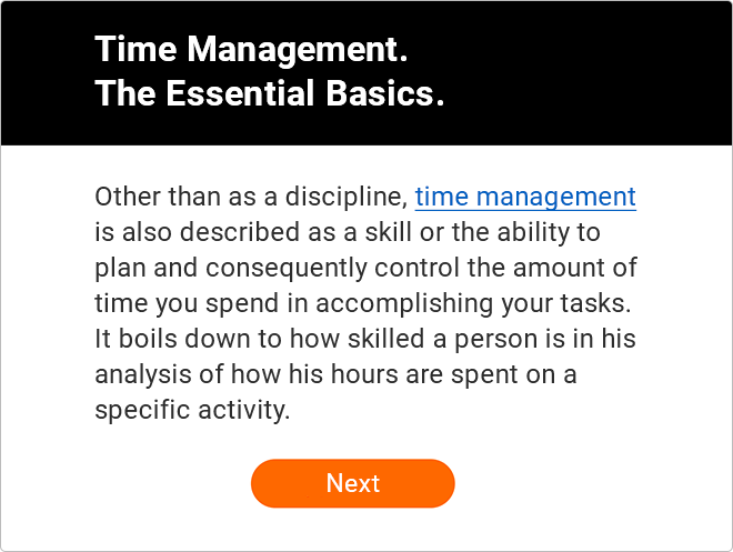
1. Break Content Into 1-2 Minute Modules
The internet has drastically minimized our ability to concentrate. Twitter and Instagram have habituated us to consuming information in small chunks: on average, one session lasts as little as 72 seconds. The Nielsen Norman Group arrived at this figure through a survey of internet users; analysts canvassed people from 8 countries including the US, Australia, China, and Great Britain.
The takeaway: Large courses are not meant for mobile devices. It’s better to chunk content into short modules so learners can study on the go anytime and anywhere.
A module is a small course within a larger one. It covers one topic, just like a chapter in a book.
The authors of Google Primer, a mobile app that covers the basics of digital marketing, broke up their learning program into modules. In Primer, one module is a deck of 5 or 7 cards. Each deck covers one rule.
Source: medium
In 2 minutes, users get a small portion of knowledge and can apply it right on the spot.
2. Track Progress
A good mobile app makes a digital bookmark when users take a break, and reminds them to pick up where they left off.
If you don’t want to break up a larger course into modules, the app still saves the progress and allows learners to study the material in several steps. They can start today and continue tomorrow from the place where they stopped.

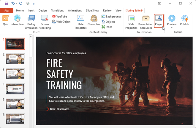
If you want a course to save progress, click Player on the iSpring Suite tab.
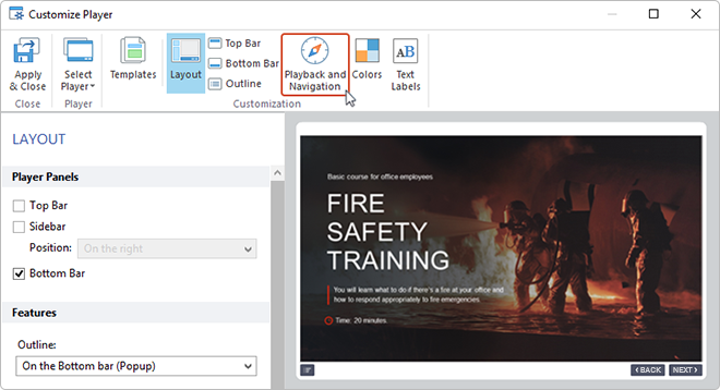
Then, click Playback and Navigation on the toolbar in the pop-up window.
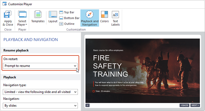
On the left panel, in the Resume Playback section, choose Prompt to resume.
3. Find Out How Users Hold Their Devices
People hold their phones differently depending on the model, situation, and particular task, as proven in a study by Steven Hoober. He made 1,333 observations of people using mobile devices on the street, in airports, in cafes, and other places. The study showed:
49% of users hold and use a mobile phone with one hand. Usually, they simply scroll through the screen while doing something else: carrying bags, holding babies, opening doors, and so on.
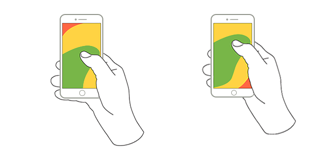
Green indicates the area a user can reach easily. Source: uxmatters.com
With this touch map, you can understand which areas aren’t good for menus and other navigation elements.
36% of users use two hands to hold a mobile phone, but use only one hand to touch the screen or buttons. According to Hoober, people use this position to select an object on the screen or tap a link.
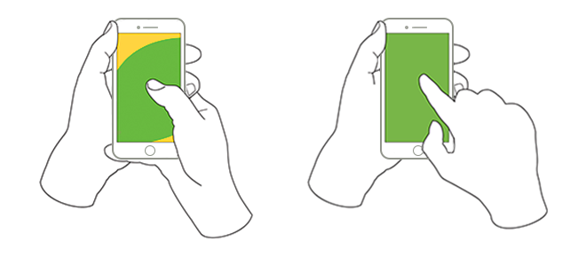
This method allows users to interact with the whole screen: e.g., selecting objects and tapping links
15% of users prefer two-handed use. This position is convenient for typing.
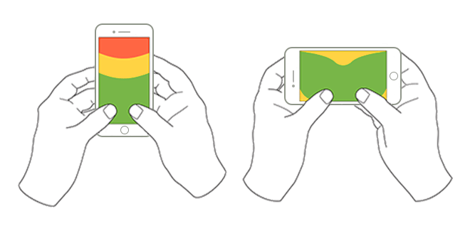
In this position, users type with both thumbs
Define what actions you expect from learners:
- Scrolling: For articles and longreads;
- Tapping objects on a screen: For slide-based courses;
- Scrolling, tapping, and typing: For courses with tests and conversation simulations.
The way you expect learners to interact with the content determines the choice of orientation; i.e., portrait or landscape.
Show learners how to hold their devices before they get started.
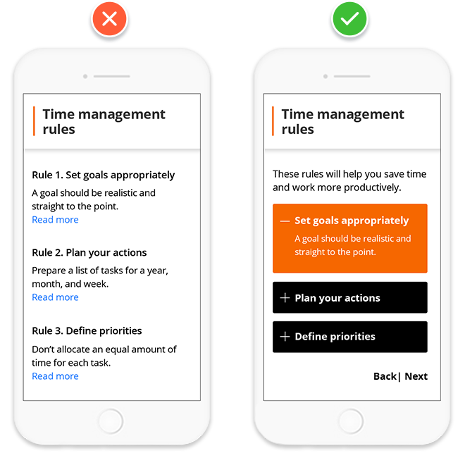
4. Put Important Things in the Center
When people read on mobile devices, their attention is focused on the center of the screen.Take a look at these heatmaps:
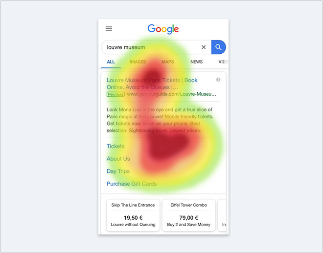
This is a heatmap of Google’s search results page. Users click on the center of the page.
In most cases, people scroll through content to bring the part they’re focused on to the middle of the screen.
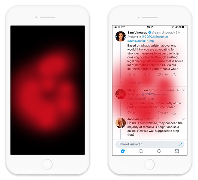
A heatmap of a Twitter newsfeed. Source: uxmatters.com
Place the most important buttons and notifications in the center, so users can immediately see and easily access them.
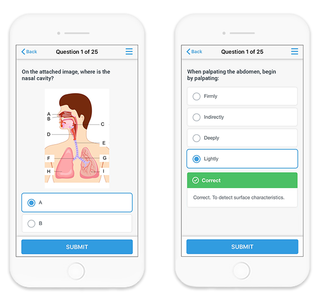
The answer choices are located in the middle of the screen
5. Work Out Tutorial
Opening a course for the first time is like being a stranger in a strange land. If you don’t want your users to get lost, give them a quick tour: show all the buttons and explain their functions. Tutorials in e-courses often look like pop-up hints over a shaded background.
In a mobile course, many learners mistake this intro for an ad banner and simply close it. Not only that, the same learners will probably get stuck on the next screen because they can’t find the right buttons.
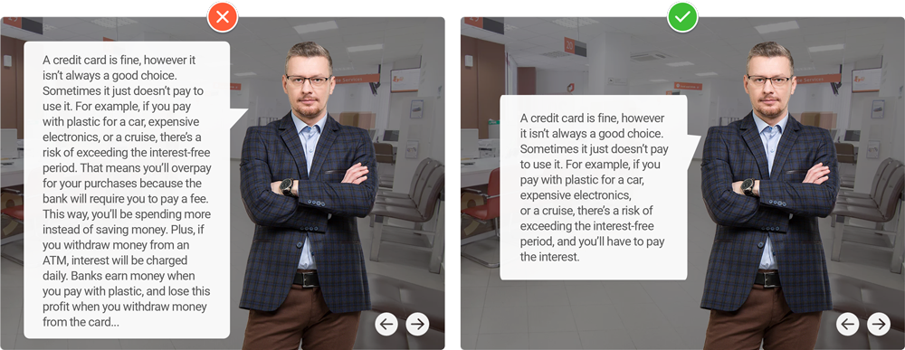
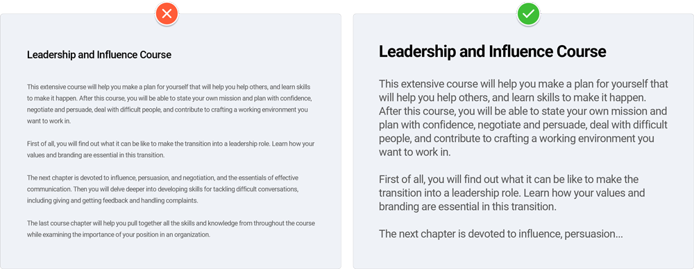
6. Minimize Text on Slides
If there’s a lot of text on the screen, it’s small and difficult to read on mobile devices. Remove unnecessary words and break down long sentences; one line should contain a maximum of 40 characters. Follow the rule: one screen — one idea.
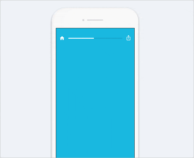
7. Add A Progress Bar to Your Course
It’s easier for a learner to finish what they’ve started when they can clearly see how much is done and how much is left. For example, we can see the number of pages in a book. Same way, a course may have a progress bar.
A progress bar can look like a line on top of the screen that moves from left to right as a learner is scrolling. The bar indicates which part of the course a learner views now and how much is left to complete.

8. Use 16 Pixels Font Size or More
When reading articles on the web, text can be scaled as necessary. For e-courses, it’s not always possible, so use 16px or larger fonts. Smaller letters are unreadable.
Also, for mobile courses, it’s better to use sans-serif fonts such as Arial, Verdana, or Trebuchet. They are more convenient to read from a phone.
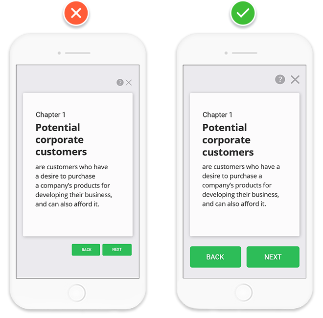
9. Make Interactive Objects Fat-Finger Friendly
Fat-finger syndrome is when interactive objects are too small and users can easily click the wrong element. So make sure you leave enough space around buttons, and also make sure they’re big enough so that users’ fingers can easily tap them.
10. Stop Using Hyperlinks
Hyperlinks are often used in e-courses for desktops. However, when creating mobile-first content, it’s better to avoid them, because users might unintentionally tap on a link when swiping between pages.
From a computer, hyperlinks look OK

In a mobile course, a user can unintentionally tap on a link
It’s much better to use buttons, tabs, and other large elements that are native to the mobile user experience.
Another challenge for mobile courses is the dizzying array of viewport sizes; that is, how much your users will see depends on the model and type of device they’re using. It seems like it’s impossible to make sure your content looks perfect on each and every gadget. We analyzed 9,000 users of the iSpring Learn mobile app and made a list of the top 3 most popular devices. You can use this list as a starting point.
| Android | iOS |
|---|---|
| 1. Samsung Galaxy Tab Active (SM-T365) | 1. iPhone 7 |
| 2. Samsung Galaxy Tab A (SM-T285) | 2. iPhone 6 |
| 3. Samsung Galaxy J3 (SM-J320F) | 3. iPhone 6S |
Takeaways:
- Break up large courses into small blocks. One session on a mobile device lasts only 72 seconds on average.
- Don’t overload the screen with text. If there’s a lot of text, it’s too small and difficult to read. Remove excess words and use at least 16px font size.
- Keep in mind that 49% of users prefer holding their devices vertically in one hand.
- Make buttons large enough and leave space around them so users don’t tap in a wrong spot.
- Put the most important things in the center of the screen to grab users’ attention.