My cloud presentation looks too small on WordPress. What should I do?
When you embed a PowerPoint presentation uploaded to iSpring Cloud (classic) on a Wordpress site, it may look too small. For example, like this:

Let’s see how to resolve it.
Solution for desktop
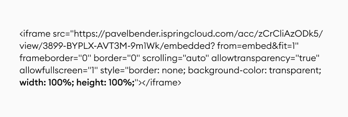
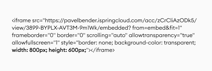
You can easily fix this by editing the width and height parameters in the embed code and replacing percents with pixels. For example:
original:

modified*:

*Note that sometimes the maximum content width can be limited (depends on the WordPress theme).
Now your presentation should look better:

That’s great, but there’s another problem – fixed size means “not responsive” and, as we know, responsiveness is the key to the modern web experience (smartphones).
Solution for desktop + mobile
If you want your embedded presentation to look great across all devices, follow the steps below:
- Copy your presentation’s embed code fr om iSpring Cloud (classic) to a text editor (like Notepad)
-
Delete the width and height parameters:
before: transparent; width: 100%; height: 100%;">
after: transparent;"> -
Copy the text below and ins ert your embed code as shown:
<style>.embed-container { position: relative; padding-bottom: 56.25%; height: 0; overflow:
hidden; max-width: 100%;}
.embed-container iframe, .embed-container object, .embed-container embed {
position: absolute; top: 0; left: 0; width: 100%; height: 100%;
}</style>
<div class="embed-container">your Cloud embed code</div> -
Here's an example of how the result should look:
<style>.embed-container { position: relative; padding-bottom: 56.25%; height: 0; overflow:
hidden; max-width: 100%;}
.embed-container iframe, .embed-container object, .embed-container embed {
position: absolute; top: 0; left: 0; width: 100%; height: 100%;
}</style>
 <div class="embed-container">
 <iframe src='https://pavelbender.ispringcloud.com/acc/zCrCliAzODk5/view/3899-rtiLD-
gHYGQ-Z3ZHn/embedded?from=embed&fit=1' frameborder='0' border='0' scrolling='auto'
allowtransparency='true' allowfullscreen='1' style='border: none; background-color:
transparent;'></iframe>
</div> -
Open your WordPress post, switch to the Text mode, and copy-paste the code from your Notepad window
-
Publish the post and enjoy the results
This should make your presentation look good on both desktop and mobile (orientation doesn’t matter).

Addition – grey bars:
Look at the code that you generated in step #5. Can you see the padding-bottom: 56.25% attribute?
<style>.embed-container { position: relative; padding-bottom: 56.25%; height:
This attribute is what determines the aspect ratio of your embed object, so if there are grey bars on the top/bottom or sides of your presentation, you need to change its value.
Here’s how it’s calculated:
padding-bottom = (presentation height / presentation width) * 100%
For example, let’s find it for 16:9:
padding-bottom = 9 / 16 * 100% = 56.25% - this wh ere the default val ue comes from.
If you still have questions regarding the topic after reading the article, feel free to contact us.
Related Articles
