12 PowerPoint Tips to Make Your Slides More Effective


The design of your PowerPoint presentation is often underestimated. Everyone knows the saying, “a picture is worth a thousand words,” but in PowerPoint land, it seems to be quite the contrary.
“A thousand words are worth a single picture” would seem to be a more fitting slogan. Slides are often filled to the brim with text, which the presenter literally reads out loud. And that’s why PowerPoint has a reputation for being dusty and static. A missed opportunity!
A well-designed PowerPoint presentation can help deliver your message to the audience. We talked to PowerPoint expert Ferry Pereboom, who shared 12 PowerPoint tips and tricks to help you steer your presentation in the right direction.
You can go through the following list to improve your entire presentation quickly with these tips. It’s a good idea to use it as a checklist to ensure that your slides are alright in three major aspects: text, design, and navigability.
| Tip | |
|---|---|
| Texts | |
| Design | Select relevant, adequate visuals Use mock-ups instead of screenshots and diagrams |
| Navigability | Minimize the variety of transitions |
Now, let’s cover recommendations for each of these aspects in more detail.
Texts
Texts on slides support your oral presentation and aim to emphasize the key points. It’s common knowledge that using too much text on slides is a sure sign of a bad PowerPoint presentation.
However, many speakers still try to cram a truckload of information into their slideshows. That makes it especially important to do a good job on the text aspect in the first place.
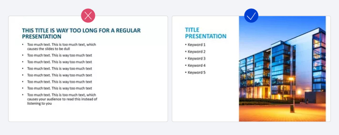
1. Keep it short and to the point
As mentioned, one of the most important things to remember is that PowerPoint is a tool made to support your story. So, it’s wise to avoid putting the entire text on the screen, because your audience will prefer listening to, and not reading the things you plan to say.
Instead, try to reduce the text, shorten your bullet points, and keep them short and sweet. You can use the 5×5 rule as a reference: have up to 5 text lines on each slide, each of them with no more than 5 words per line.
Keeping your texts concise will help engage your audience and make them focus on you instead of the slides on the screen.
Pro tip: Optimize the use of white space – that’s what we call empty space, that’s devoid of any color, text, and other elements. Keeping it empty helps to direct the viewer’s gaze.
In the realm of texts, you can bring a breath of fresh air to your slides by adding extra margins, splitting up long paragraphs, and generally trying to place objects in no more than half of the slide.
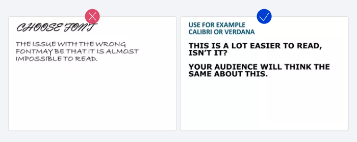
2. Choose the appropriate font
Try to pick a classic font instead of a creative one. Choosing the wrong font can easily make your text unreadable to your audience. And besides, if the computer you are presenting on doesn’t have the font you used installed, PowerPoint will replace it with another one at random.
Sans serif fonts like Verdana, Calibri, and Helvetica are all safe choices. These fonts are quite popular and available on all computers.
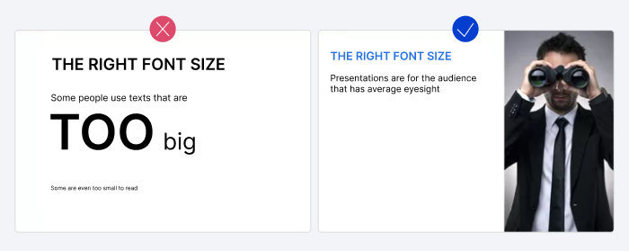
3. Enhance readability with the proper font size
Generally, for more effective PowerPoint presentations, it’s always a good idea to make important lines of text and facts look bigger, bolder, and brighter than the others. Fonts can help with this as well. But picking the right font size can be difficult.
On the one hand, your audience needs to be able to read the slide. And on the other hand, you don’t want your text to dominate the space, as you’d probably like to add some visuals to your slide as well.
Still, there are quite precise font sizes that you can refer to in order to make good PowerPoint presentations.
For headers, the minimum is around 20pt, while for the body you can have a minimum of 18pt. With these sizes, you can be assured your text will be legible in every situation. Learners will feel comfortable viewing your presentation on laptops, computers, tablets, TVs, and large screens.
Pro tip: You can manage the hierarchy of headings and subheadings on your slides with the Slide Master feature. Here you can also apply color schemes and a logo to any number of slides and achieve a consistent, unified look.

Design
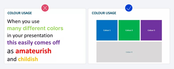
Simple, yet brilliant design can enhance your message and facilitate communication. So, when you design your slides, try to find balance and remember that less is more.
It’s always better to use 3 or a maximum of 4 colors that you know will combine well, instead of an entire palette, and align objects to establish symmetry.
Below are a few more simple PowerPoint design tips that will help you create a good presentation.
4. Increase contrast
Besides the look and size of your font, it is important to take contrast into account to facilitate reading. It’s natural to use dark text on a light background, and vice versa. But if you’re using text on a photo, things can get a little more tricky.
It’s a good idea to either place a border or cast a shadow around the text to ensure that it’s readable. Or you can place text in one of the PowerPoint shapes.

5. Use coloring wisely
Colors are often used to give the slide some ‘flair’ and manage attention. When picking colors, it’s important to keep your audience in mind and define the purpose of the actual presentation.
For instance, it’s good to use vibrant colors in a presentation for a primary school. However, if you prepare your presentation for business professionals to deliver it in a formal setting, you’ll need to define your colors according to your target audience.
6. Select relevant, adequate visuals
When people are talking about a car, we often see that the first picture is taken from Google images, or even worse, that clip art is being used.
This results in inconsistency because some images tend to be illustrations and drawings, making your presentation look unprofessional or simply ruining the viewer’s impression of it.
To make your PowerPoint presentations effective, don’t use low-quality visual aid. Make sure you select good quality images that support your message.

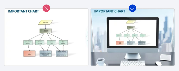
7. Use mock-ups instead of screenshots and diagrams
Diagrams, schemes, and screenshots usually don’t help your presentation. Although this information is usually quite important to your story, it can be excessive.
To turn the slides into a good PowerPoint presentation, it’s a good idea to combine the diagram, scheme, or screenshot with an image, such as an image of an iPad, laptop, digital projector, or computer.
In the example below, you can see that the slide looks much tidier when an image is added.
8. Present data visually as much as possible
Whenever your presentation contains a lot of data, it might be easier to communicate this data by using visual formats instead of just using text.
Graphs might give you the results you’re looking for. PowerPoint offers a wide variety of ‘doughnut’ charts, which are ideal for making comparisons.
For example, pick the doughnut graph to show your percentages in the middle of the graph. That way, your audience immediately understands your message.

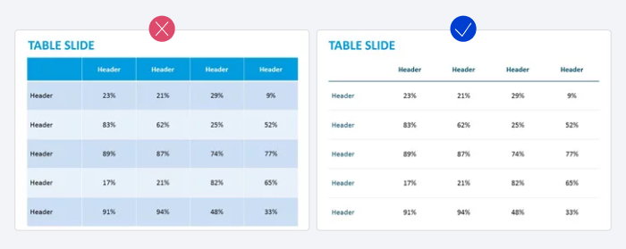
9. Simplify your tables as much as possible
Tables are usually crammed with information and numbers. This causes a slide to look crowded and chaotic. In this case, it is important to make the tables as simple as possible.
Delete unnecessary outlines, colors, and borders. Again, “keep it simple” and “less is more” are key phrases to keep in mind when designing tables.
Navigability
Navigability applies more to the way you deliver slides to the audience and manipulate the playback. However, you need to plan this in advance as well, and pay attention to transitions, notes, animation, and other aspects that will result in an effective slideshow and save you time.
Here are a few essential PowerPoint tips for easy navigation in your presentation slides.
10. Minimize the variety of transitions in your PowerPoint presentation
After creating a PowerPoint slide show, people usually conclude that the presentation comes across as boring or static. So, they start to use transitions. Different transitions are then used to ‘breathe life’ into the presentation.
However, this is not the way to go. PowerPoint offers the most diverse transitions, which are usually experienced as distracting and unsophisticated. A simple ‘fade’ effect to segue from slide to slide is sufficient.
11. Rely on Presenter View in PowerPoint
Presenter View can help you greatly when delivering your presentation to viewers. With this functionality, you don’t have to keep everything in your head or question your own presentation skills.
When presenting to the audience with Presenter View activated, you’ll be able to see what’s on the next slide, keep track of the time, use a laser pointer and/or pen, and be able to see your speaker notes.
You can also paste your script or lecture notes here and avoid making your slides text heavy.

12. Provide an outline of the presentation
Giving an outline at the beginning of your presentation will help you start off on the right foot, especially if it’s long or you deliver it with other speakers. It’s good form to include at least these three types of slides:
- Welcome slide. Presenters typically place the title and description of the presentation and their credentials here.
- Menu slide. You can place the contents of your presentation here to jump to the needed part quickly when needed (e.g., to refer to a particular idea during a Q&A session).
- Summary slide. This will summarize the ideas you’ve presented and will be of great help when you’re wrapping up your presentation.
Here are a few more effective tips to structure your presentation – check them out.
Unlock Learner Engagement with iSpring
Over the years, PowerPoint presentations have made their way out of classrooms and conference rooms to different audiences and evolved into truly informational products that people download, study, and share. That’s why searching for the best PowerPoint presentation tips is as relevant as ever.
If you rely heavily on PowerPoint in your work, you can improve your slides greatly with iSpring Suite – an authoring toolkit that works in Microsoft PowerPoint.

iSpring Suite can replace several design tools and PowerPoint add-ins at once. It provides hundreds of design templates, color schemes, and visual elements, allowing you to create compelling presentations and gain and maintain an audience’s attention. The software comes with Content Library, which offers access to over 89,000 slide templates, backgrounds, and characters.

In addition to the pre-designed characters, iSpring Suite also allows you to create your own unique ones. You can change their hairstyles, pick accessories, and choose clothing that matches your brand or storyline and resonates with your learners.

Since you already know how to use PowerPoint, it won’t take much time at all to master iSpring Suite and create an engaging presentation or a full-fledged online course. You can populate it with quizzes, interactions, web objects, quality audio narrations, and videos in a breeze.
Also read: How to Convert PowerPoint to MP4 Video on Windows & macOS
With iSpring Suite, you can convert your slides into HTML5 format, so your audience can view them online, right in their browsers, with no downloading necessary. You can also share your presentation as a YouTube video in a click.
Try iSpring Suite and create a stellar presentation now!
FAQ on How to Make an Effective PPT Presentation
People often look for some ready-made formulas of a great PowerPoint presentation on the Internet. We’ve found several of them for your quick reference. Feel free to use these rules along with our tried-and-true PowerPoint tips.
What is the 5–5–5 rule in PowerPoint presentations?
The 5-5-5 rule stands for having a maximum of 5 text lines on a slide with no more than 5 words in each, and up to only 5 slides in a row that use that format. Apparently, this encourages creators to reflect on the way they’re making slides, be concise, and do so knowingly.
What is the 5–second rule in PowerPoint?
The five-second rule prescribes that it should take no more than 5 seconds to grasp the idea of a slide. You can ensure that this happens by using brief and clear text lines, and convincing design.
What is the 10-20-30 rule in a presentation?
The 10-20-30 rule is a fun rule that Guy Kawasaki, a Silicon Valley venture capitalist, introduced after watching hundreds of exhausting presentations and pitches. The rule says that a presentation should be strictly 10 slides and 20 minutes long, with a 30-point font size. Learn more about this rule and how it was devised on Kawasaki’s website.
Which PowerPoint tips and tricks do you know? Which one is your favorite? Feel free to share with us below!
About the author
Ferry Pereboom is co-founder of PPT Solutions, a design agency in the Netherlands.
The company specializes in developing inspiring PowerPoint presentations. PPT Solutions has approximately 1,500 clients, and 28 PowerPoint specialists, and delivers work to clients in about twelve countries around the globe. Ferry is mainly responsible for helping both new and existing clients overcome their presentation challenges.
Please check the website www.pptsolutions.nl for more information on professional PowerPoint tips.